Survey of 22 Credit Card Forms (UX)
My credit card company recently sent me a new card ahead of my old one expiring. Unfortuantely this means logging into every service with the old card and updating it.
While some card and payment providers can now automatically update your card when it expires, this is a very opaque process, requiring you to still manually verify every service has the new card.
One interesting trend I noticed: everyone handles credit card UX differently. Because I already had to log into all these services anyway, I decided to put this post together. Props to TrueBill for being my reference on all the services I needed to update!
Below you'll find screenshots and my UX analysis of all the credit card form UIs I encountered. Hopefully this is a bit of a library for future inspiration.
Big UX takeaways
- You can dramatically reduce complexity by only allowing one card per account, but this might not be suitable for services where there is a personal/business use case mix.
- If your service allows multiple cards, build a “replace” flow for the card, particularly if you have invisible state tied to the card (like pending transactions). Deleting is scary/confusing.
- Highlight when a card is about to expire when users log in. Consider emailing them about this ahead of time, too.
- Make sure to fully support autofill (including account holder name, address, expiration date, CVV). Check all of the major implementations (Chrome, Safari/mobile, Firefox). Many miss fields, creating worse UX.
Specific Highlights
- The widget implemented by Instacart only ever has one or two empty fields presented to the user at a time, greatly reducing the stress of a giant empty form.
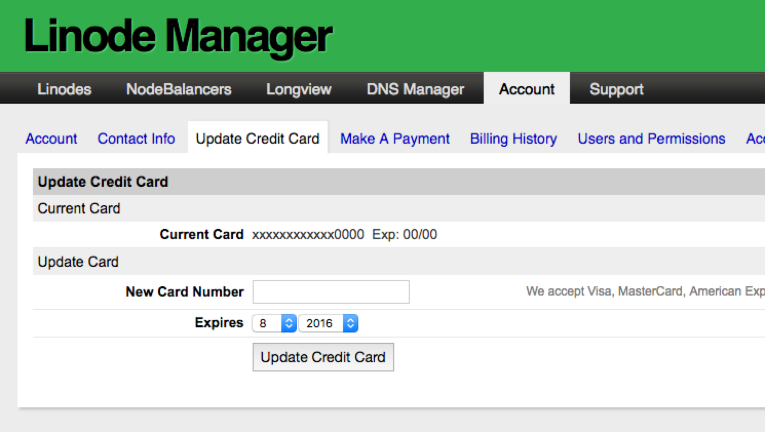
- Linode has a top-level tab called “update credit card” which has a basic three-field credit card form that correctly autofills. Of all the services looked at, Linode took the least amount of time to update.
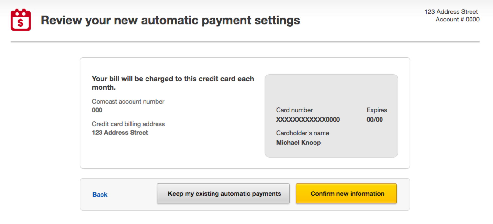
- Netflix and Comcast are great examples of slightly more complex card UIs that still don't get in your way to replace existing cards. Notably, both of these services only allow you to have one card.
- Paypal highlights a card that is about to expire on their dashboard. This was the only service that did this.
Specific Lowlights
- Systems that implement multiple cards (like Southwest) don't offer elegant ways to replace a card, the 80% use case for card management.
- Error messages that don't identify the problem or error UI that is not located near the source (eg an “error bar” across the top) were a common source of frustration with Apple, Steam, and StateFarm.
- StateFarm's logged-in dashboard has a “add a credit card” link which doesn't have anything to do with billing. The real billing settings are (obviously) behind “payments and transfers”.
- Chrome and Safari autofill consistently get the card number but commonly not the account holder name, expiration date (due to them being dropdowns), or CVV.
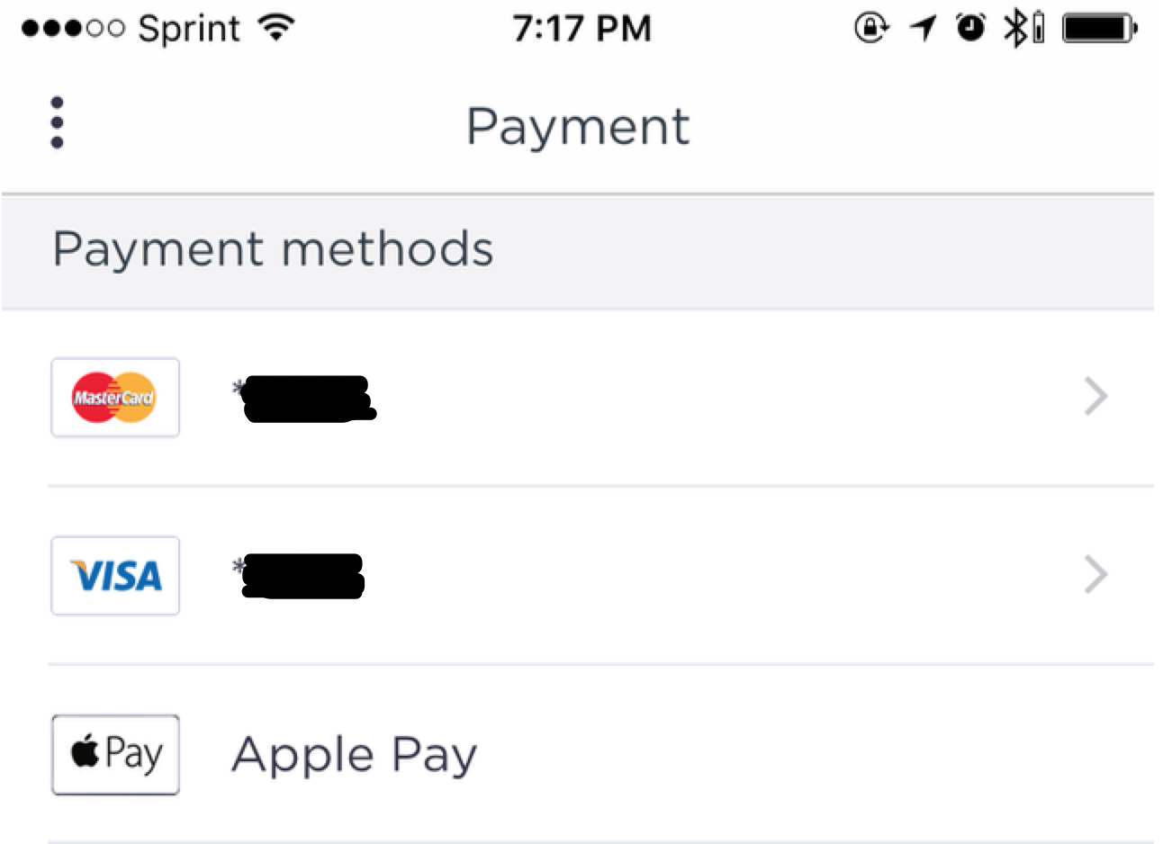
- There are many “mobile only” credit card form offenders, including ones that otherwise offer websites (Lyft, Uber, and DoorDash).
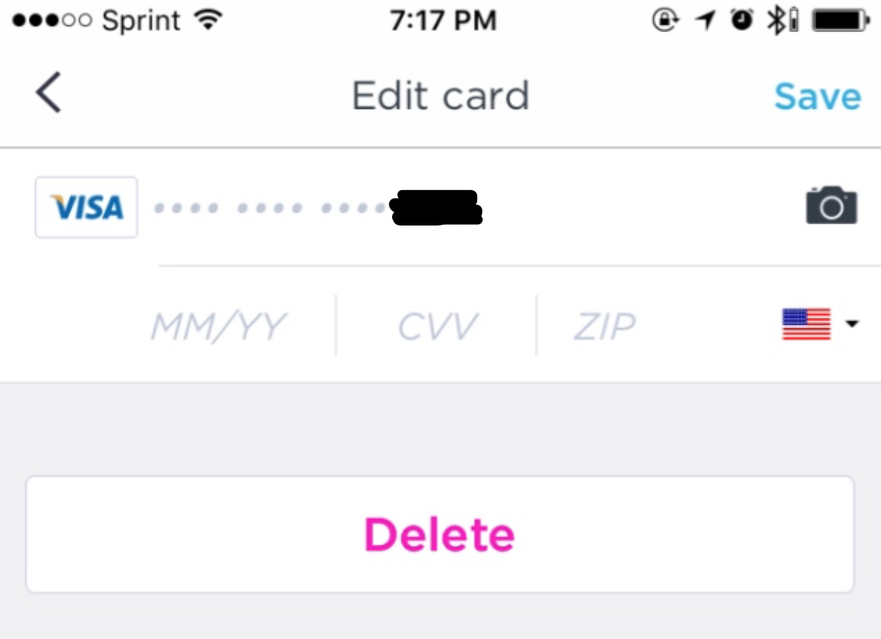
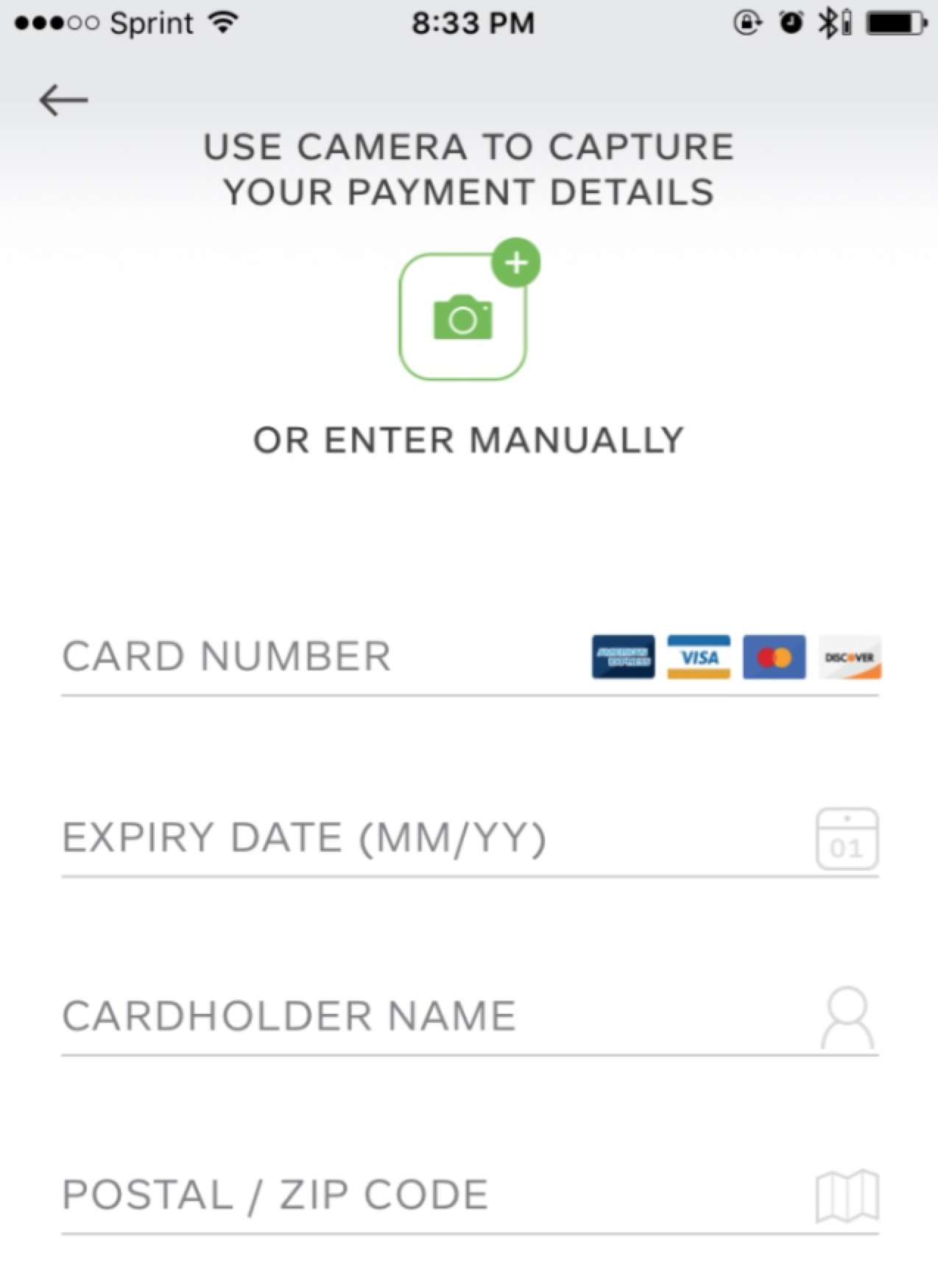
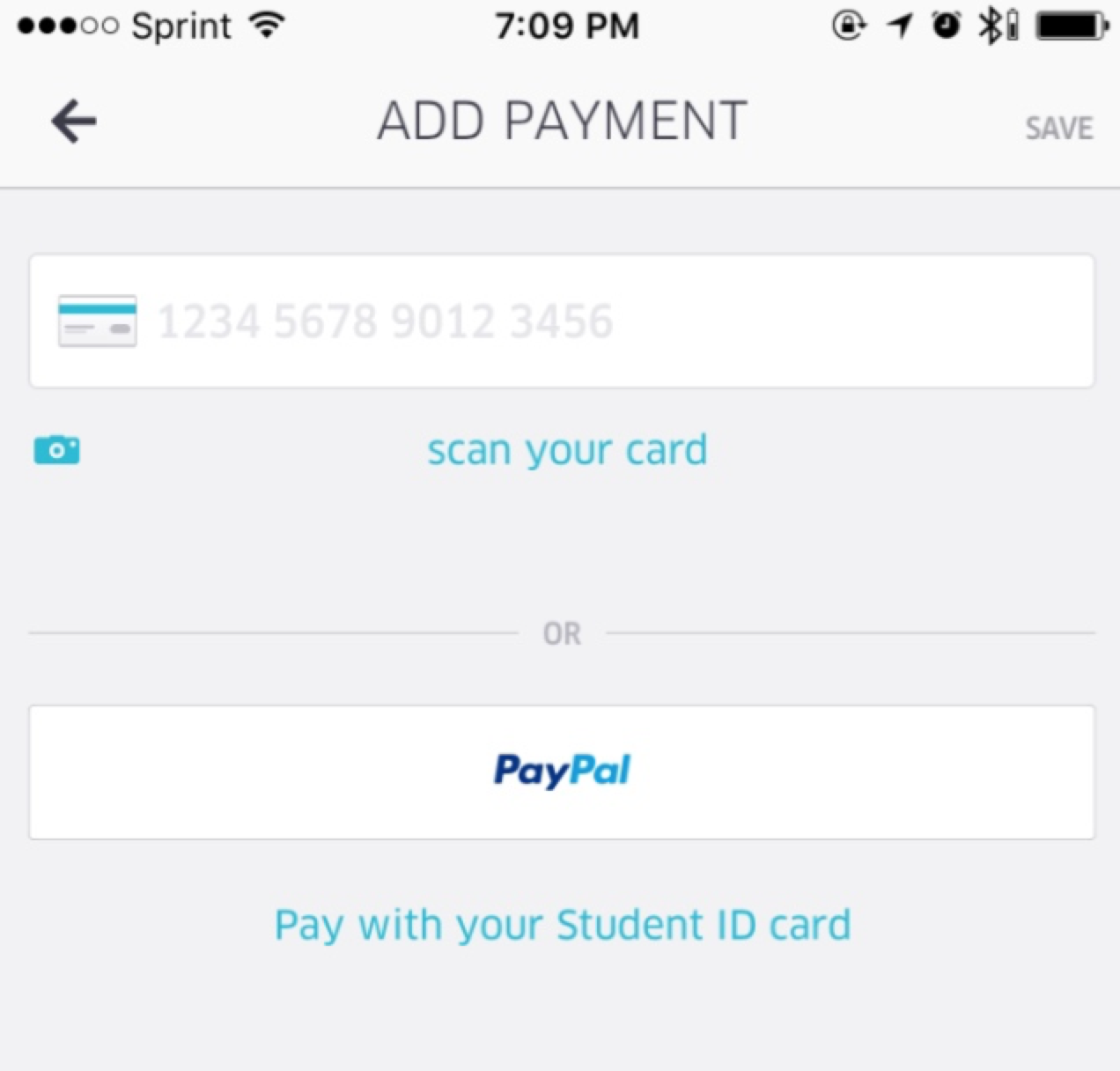
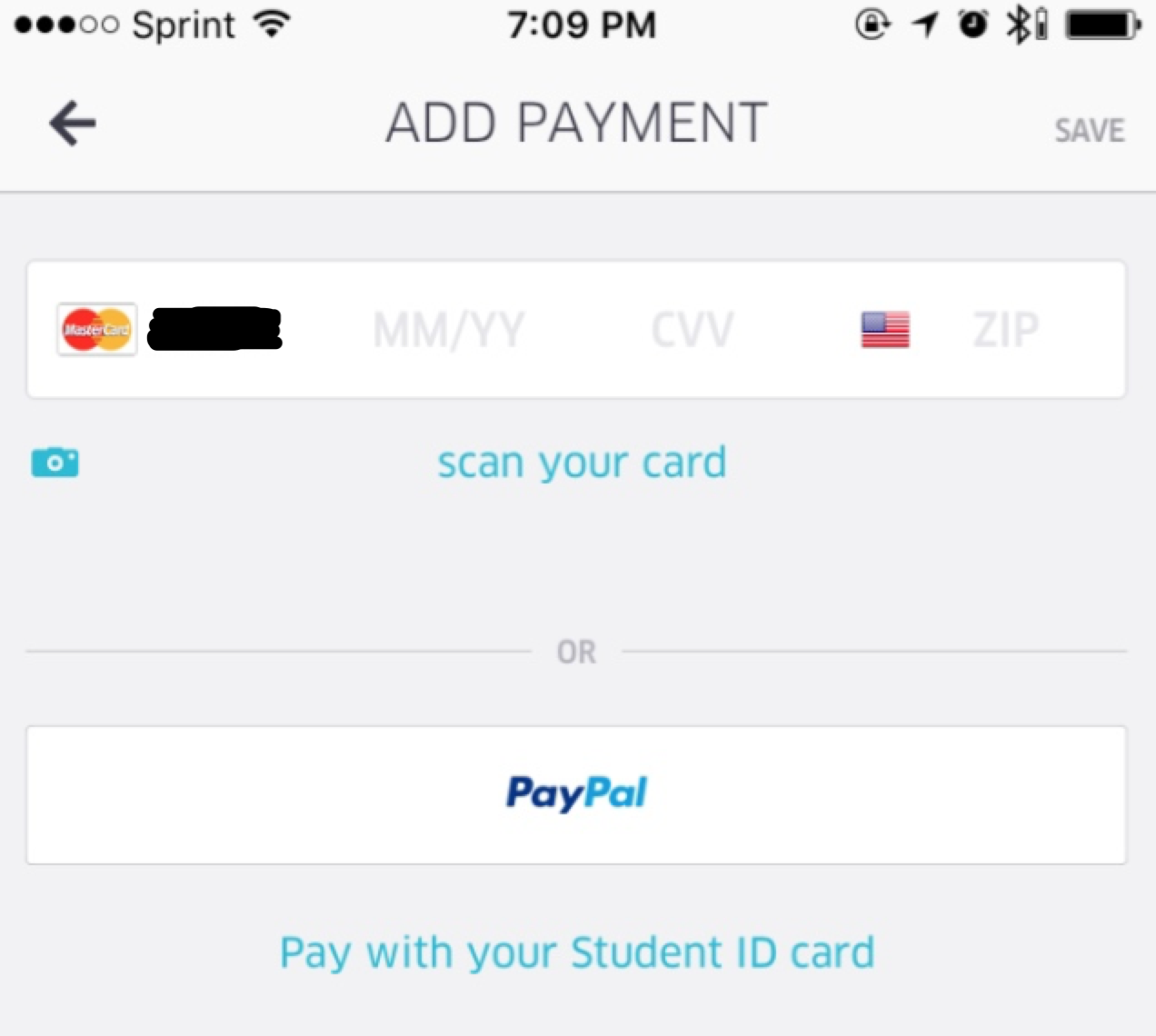
- Mobile apps that offer card scanning to ease the UX (Uber, Lyft, PayByPhone) only fill the card number. I timed it, and it actually took longer to use the scanner than just typing in all the information (due to having to align the card with the camera, wait for recognition, and verify it transcribed it correctly). If these scanners could capture the entire card front, the UX trade off would likely be worth it.
Index
These are relative links, keep scrolling if you want to just browse all of them.
- Amazon / Amazon Prime
- Apple Account / iTunes / Apple Pay
- Comcast
- DoorDash
- FasTrak (CA automatic tolling)
- Google Wallet / Account / Chrome Autofill
- Linode
- Lyft
- Instacart
- Name.com
- Nest / Nest Aware / Dropcam
- Netflix
- OSX / Safari / Keychain autofill
- PayByPhone
- PayPal
- SiriusXM
- Southwest Airlines
- StateFarm
- Steam
- Sprint
- Uber
- Zapier
Amazon / Amazon Prime
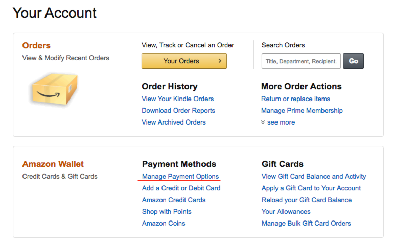
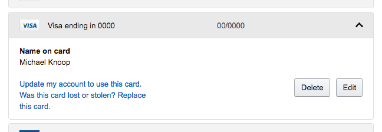
Amazon hides a surpsingly amount of complexity in it's settings and billing. Not only can you have many cards, you can have many addresses, and they seem to have a “many-to-many)” relationship.
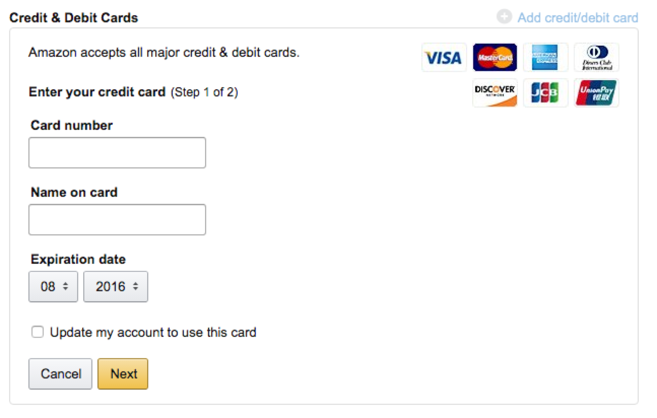
There is also an unclear checkbox “update my account to use this card”. Speculating, this is the default card most Amazon services (and Prime) will charge against.
After you add a card, you're prompted to confirm the address (which is set to the last address you shipped to using Amazon). If this is wrong, you have to back out of the whole process and update your default address in their address book, first.
Luckily, deleting the old card is straightforward.
Apple Account / iTunes / Apple Pay
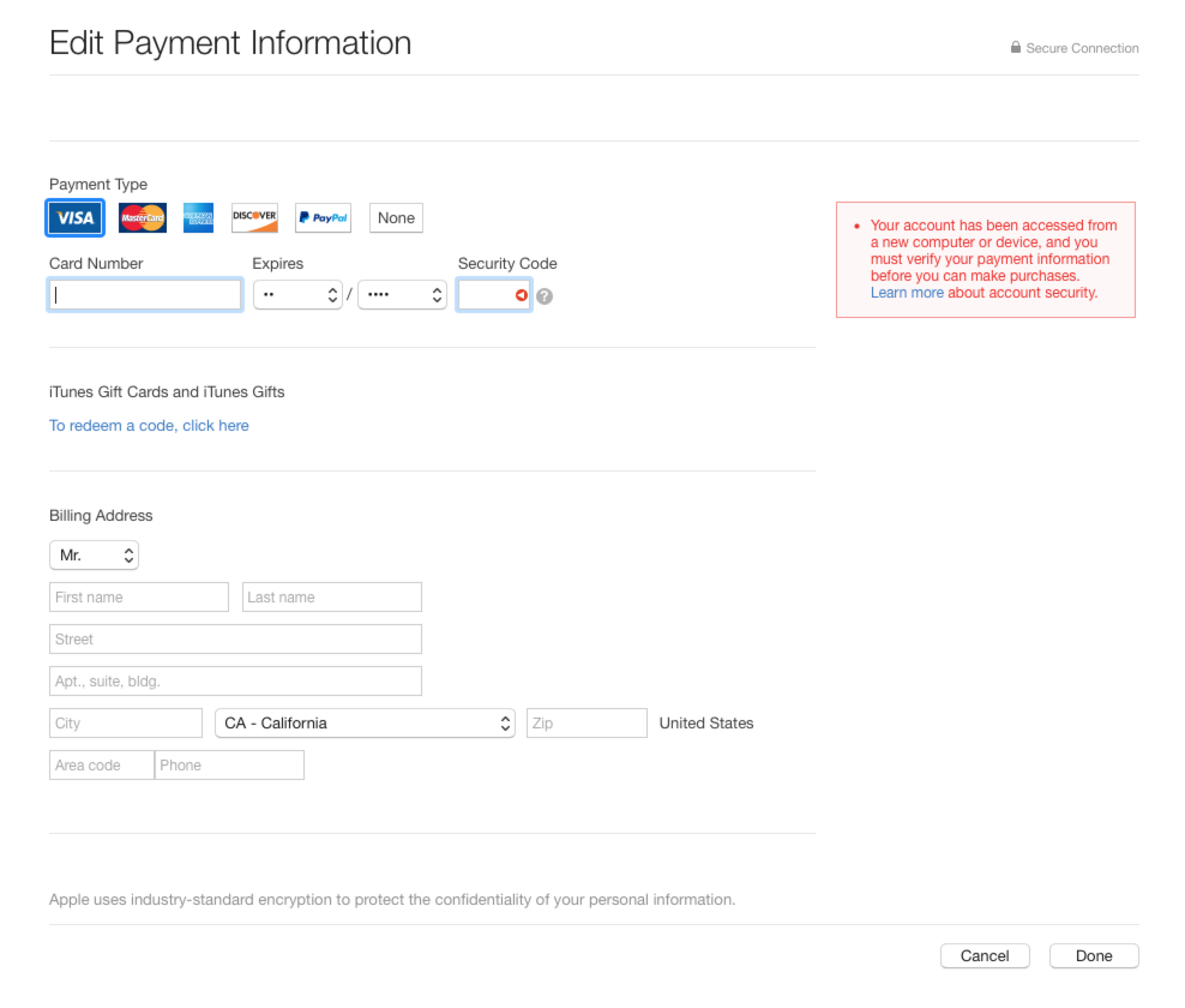
Apple only lets you have one card tied to your account, so updating it simply means editing the form in-place.
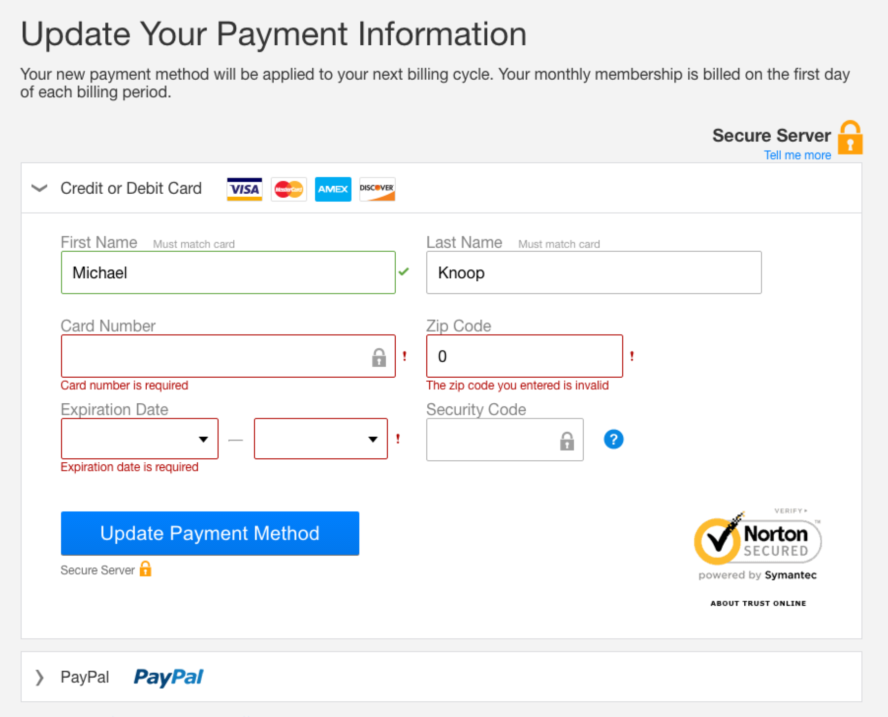
Apple forces you to pick the type of card (Visa, MasterCard, …) and if you don't, you're not warned until after you click “save”. Further, the form only has one warning area - if you had a previous warning like I did, change blindless leads you to miss the new error message.
Comcast
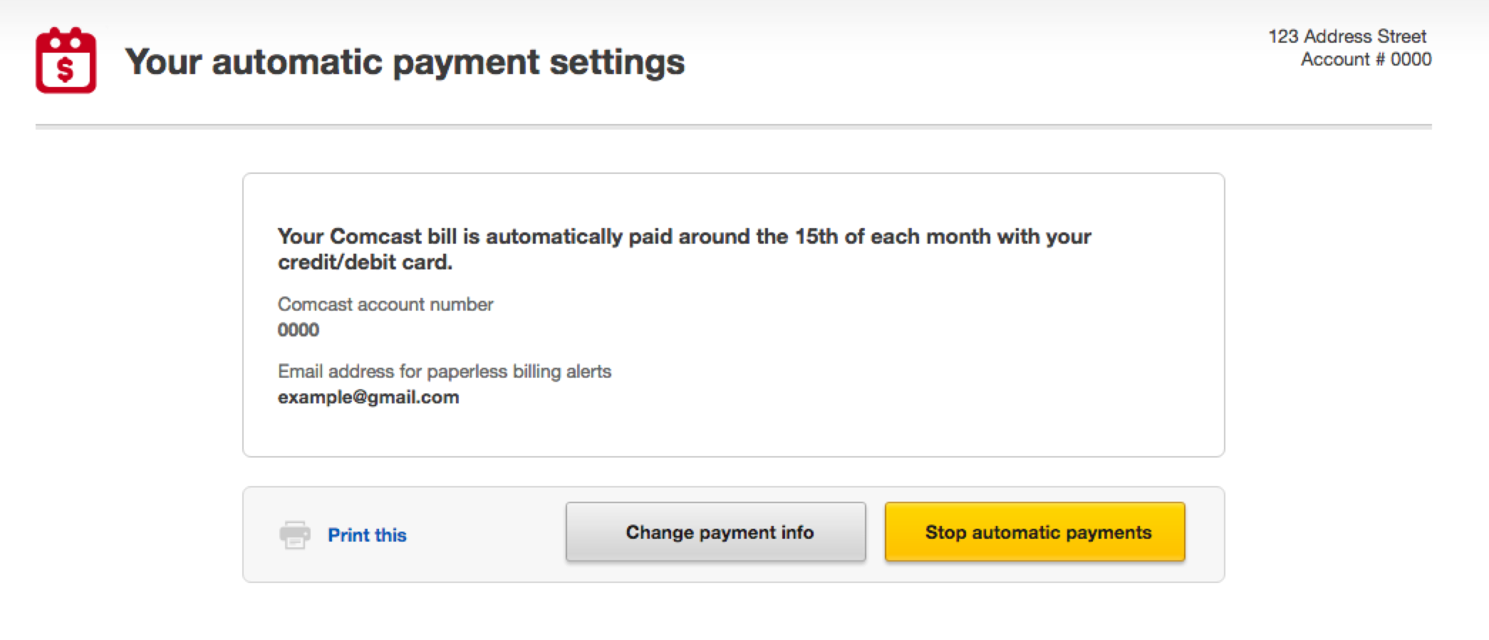
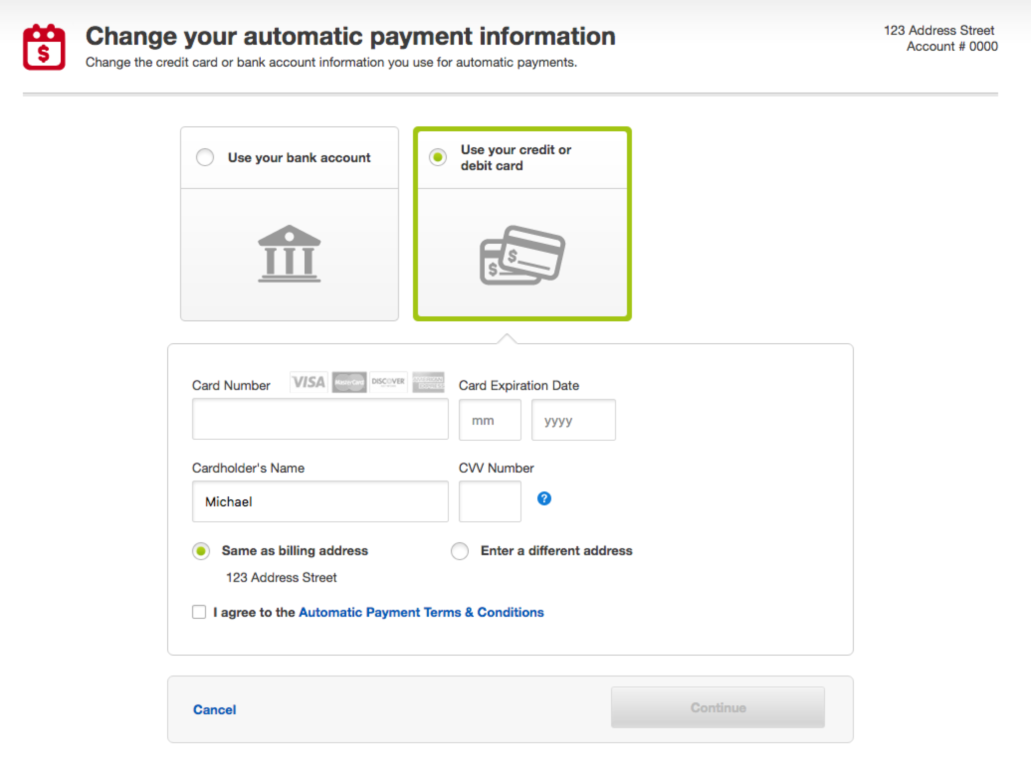
Perhaps surprisingly, Comcast was a straightforward form. The first screen below is available in one-click after signing in, and the form re-uses your saved address. Further, it seems Comcast only lets you keep one number on file so you don't need to worry about removing the old card information.
DoorDash
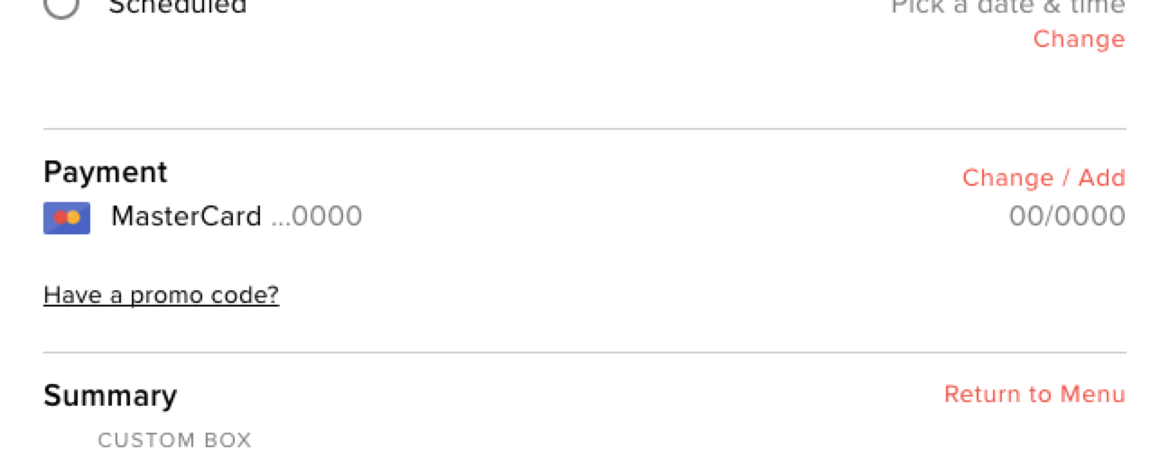
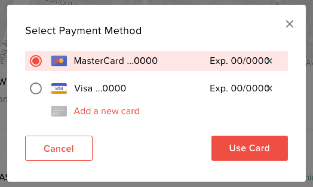
In order to view or edit your stored cards in DoorDash through their website, you have to literally create a fake order and get all the way to the final confirmation screen before you can review/change things.
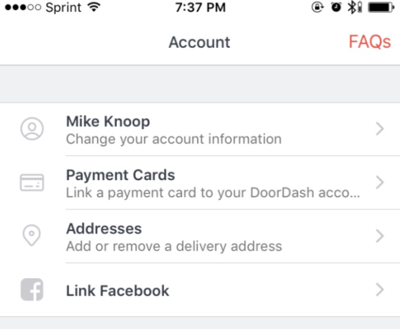
The DoorDash mobile app has billing information as the second most important menu item under “account”, which makes its absense on the website even more surprising.
FasTrak (CA automatic tolling)
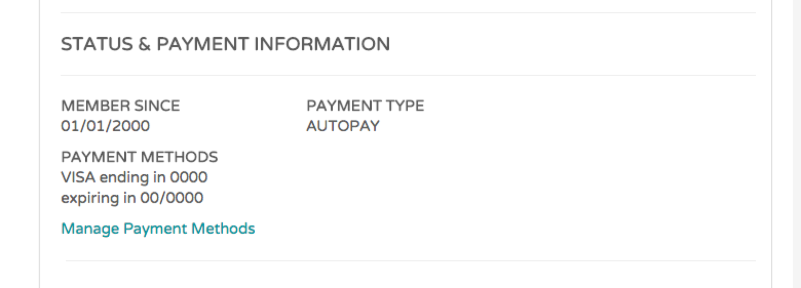
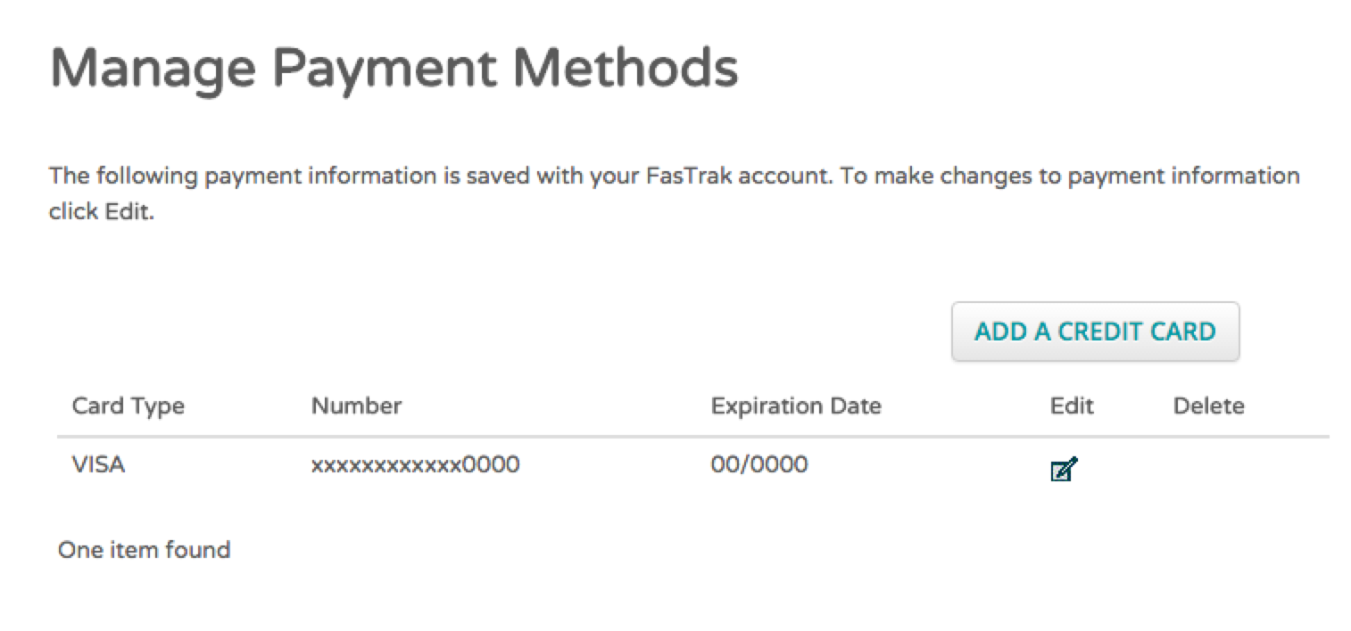
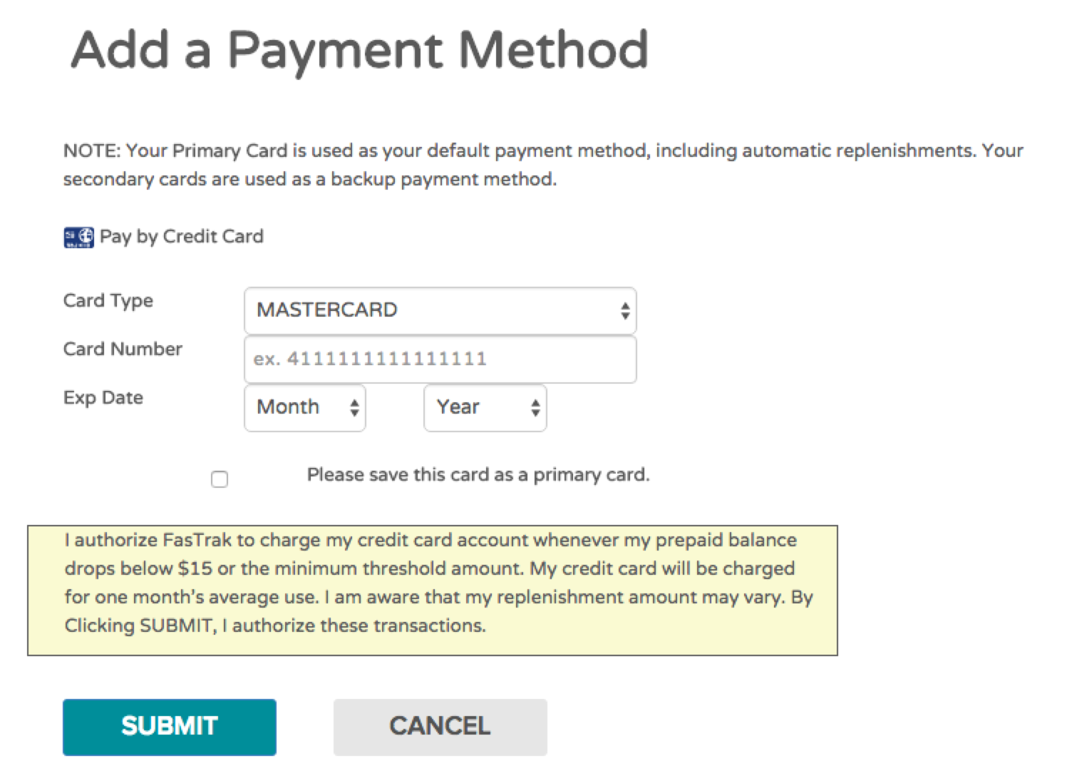
The hardest part about this system was logging in (due to some archaic username requirements). You'll have to add your new card first (and set it as the primary card) before deleting the old card.
The delete icon for the older card doesn't appear until you set a different card as primary (which isn't obvious if you missed the checkbox when adding the new card).
Google Wallet / Account / Chrome Autofill
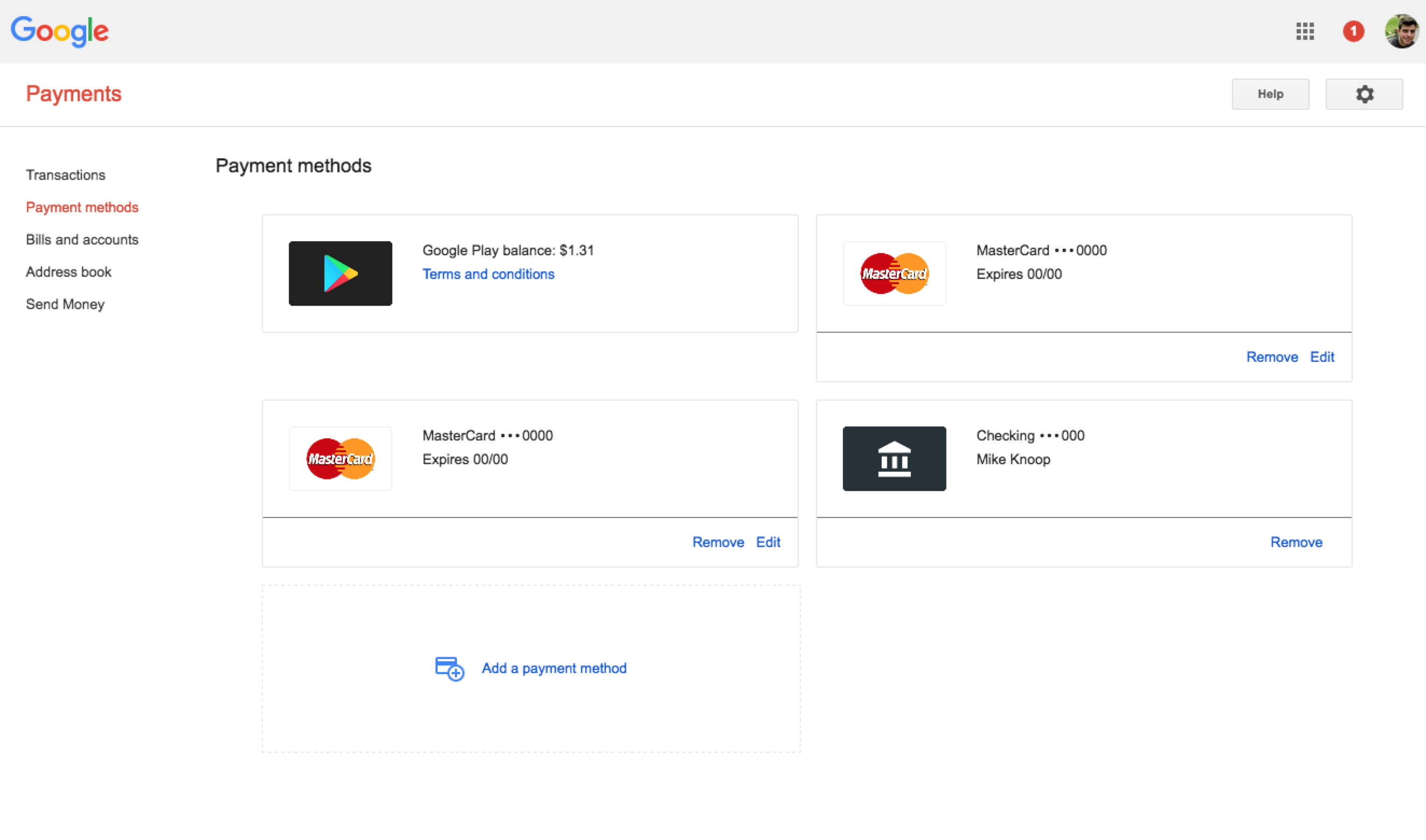
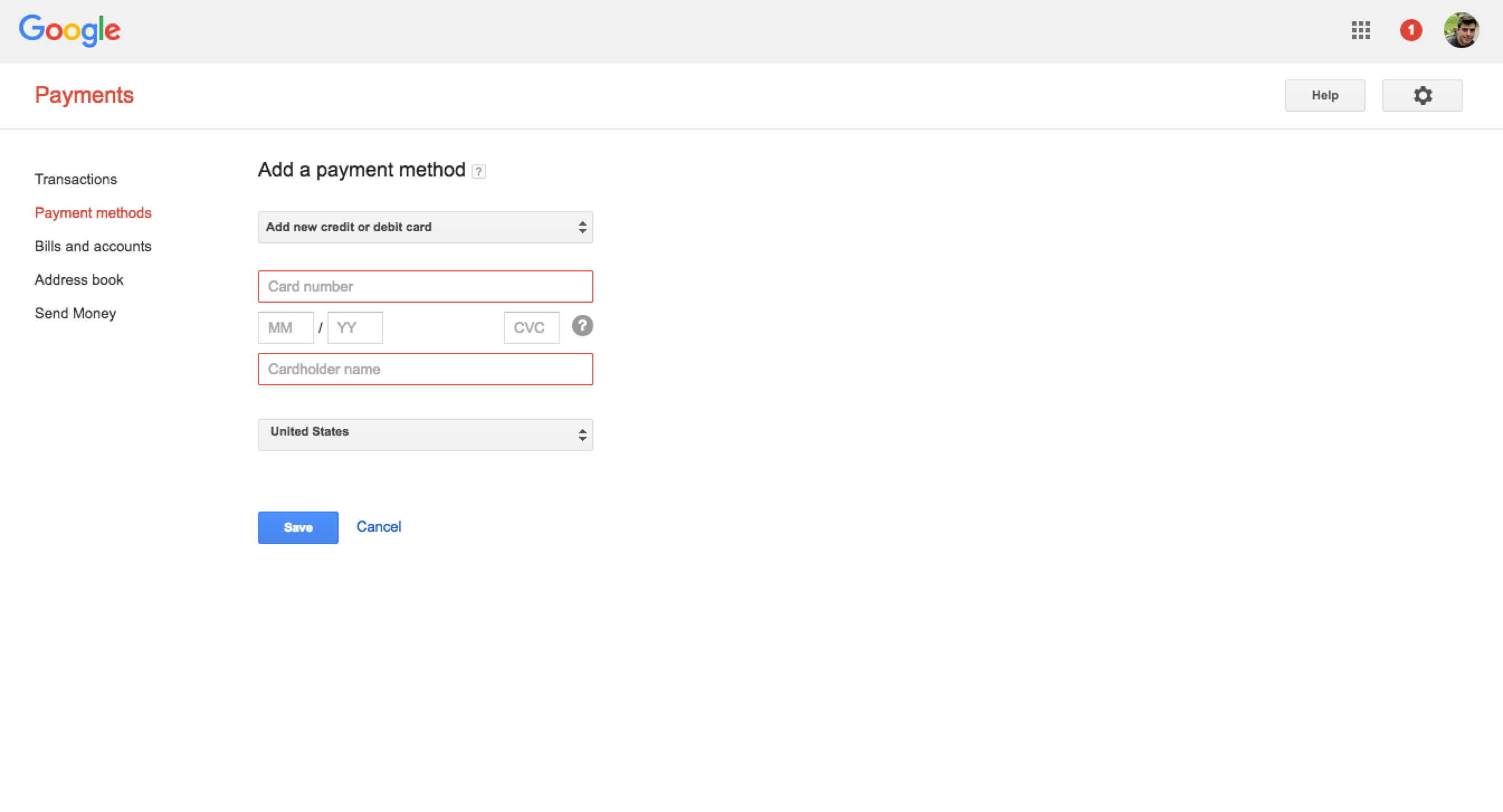
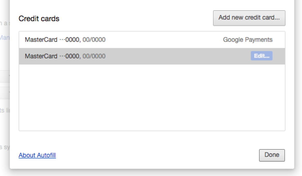
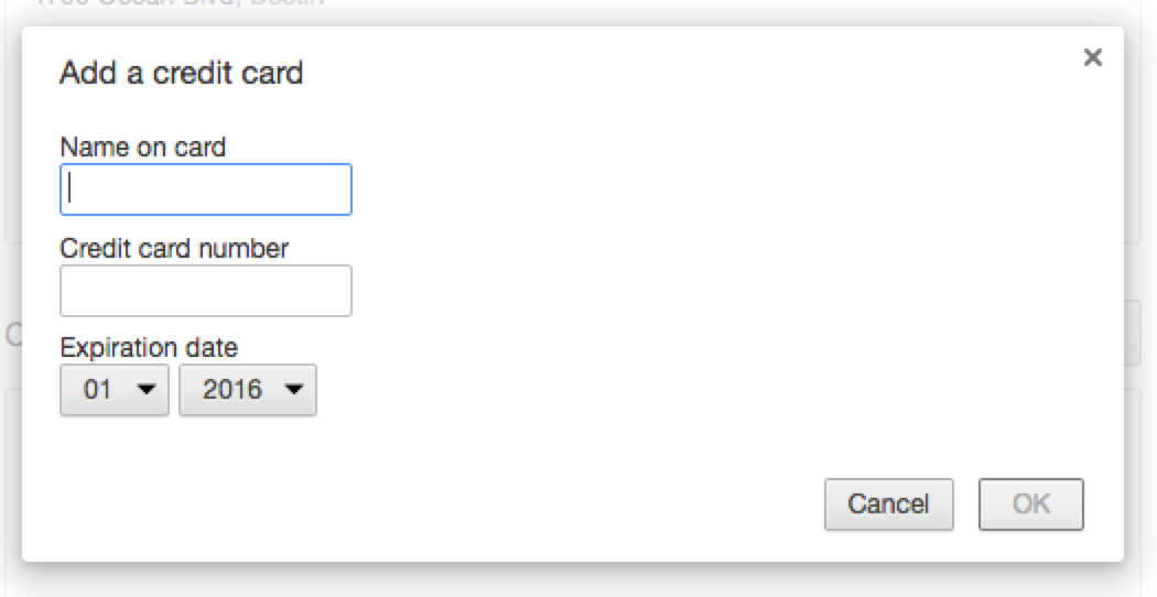
Google is very flexible, letting you have multiple cards and accounts. Chrome's autofill inherits from the connected Google Account (if you have one) although you can add and remove cards locally, too.
If you attempt to remove a card that is tied to a subscription (like, Youtube Red) Google will prevent you from removing the card until you manually go update the subscription on another part of the site.
Linode
Of all the services incluided in the this post, Linode wins on obviousness and speed. Under the tab “update credit card” there are only three fields to fill out.
Lyft
Unlike Uber, Lyft doesn't attempt to offer online pamynent or billing management.
Instacart
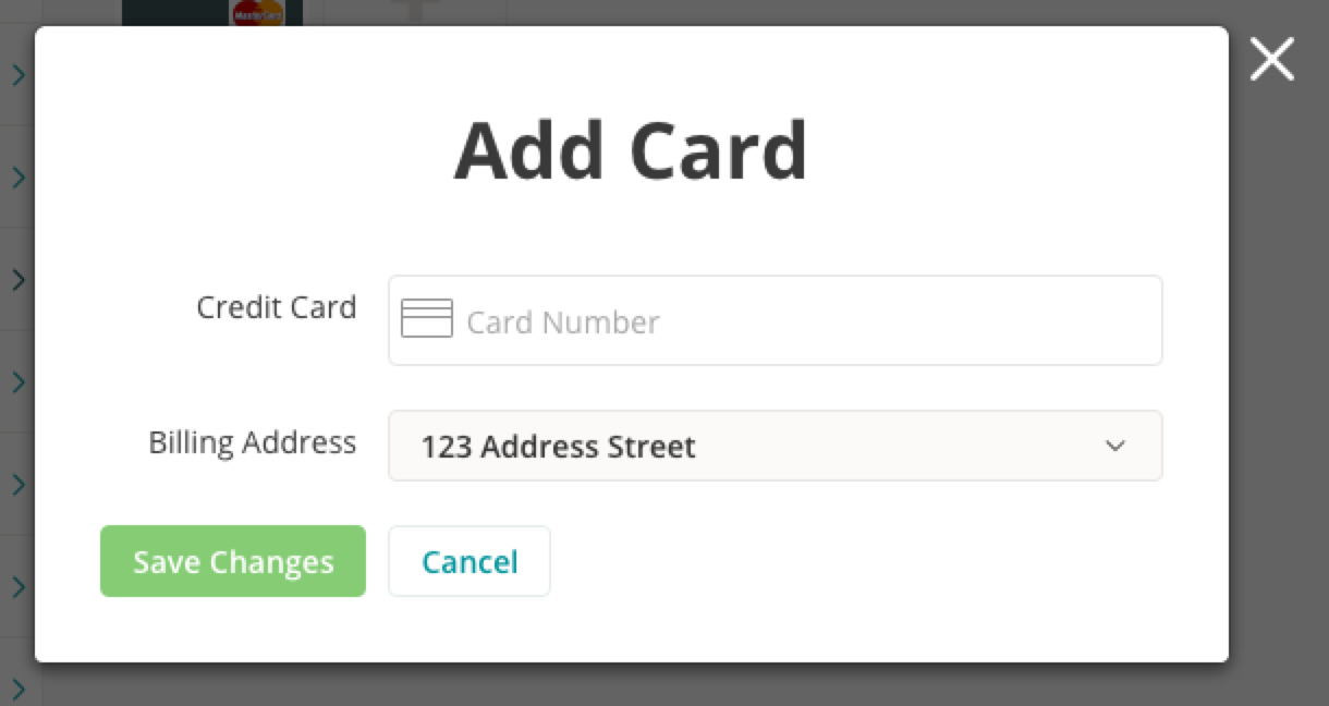
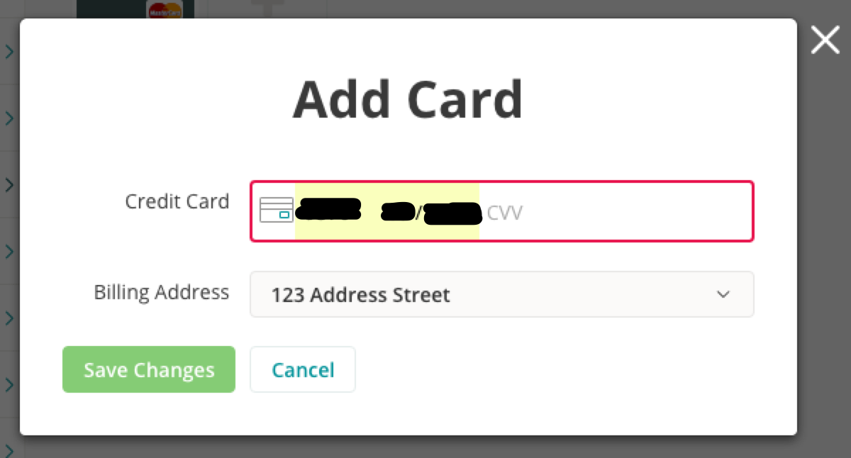
Instacart has a slick widget to add new cards. This removes a lot of the “giant form fear” that might slow or prevent someone from entering their card details. At most, there is only ever one field to fill out a time.
The management settings are easy to find and availing in one-click after logging in.
Name.com
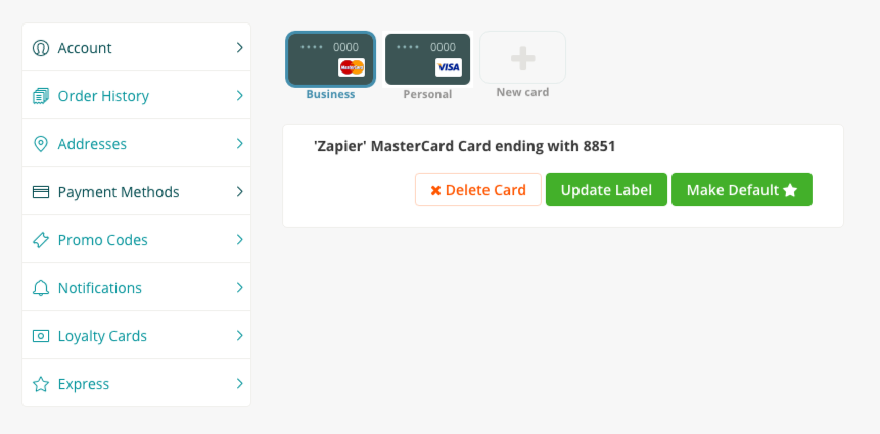
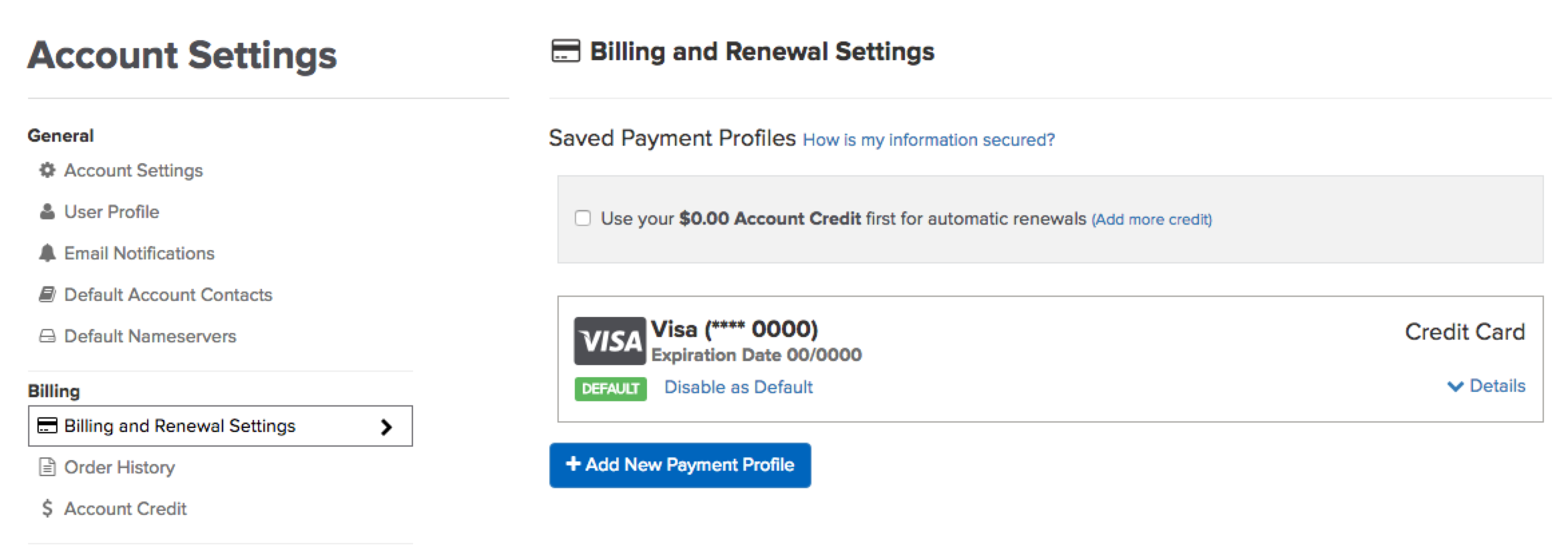
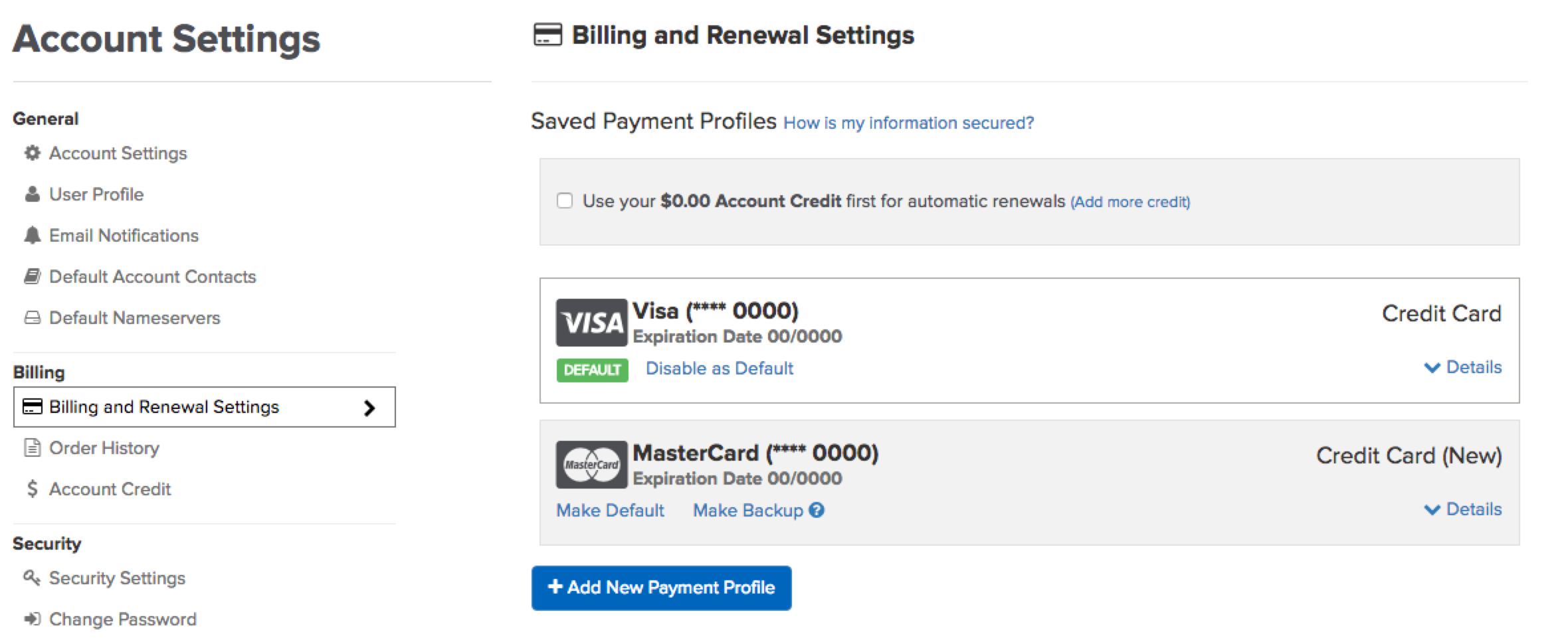
Name.com like others offers you to add multiple cards (this is common when services have both business and personal users). Another common trend is the ability to name the different cards / profiles.
Most services make you pick a name up front (effectively adding another required field). There are probably some smart defaults that could be autogenerated by looking at the names people are already using.
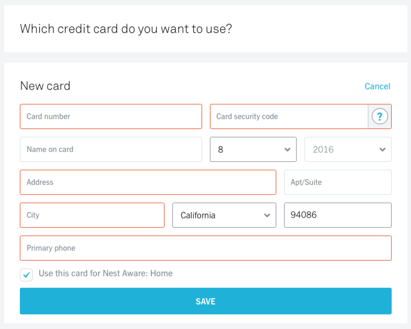
Nest / Nest Aware / Dropcam
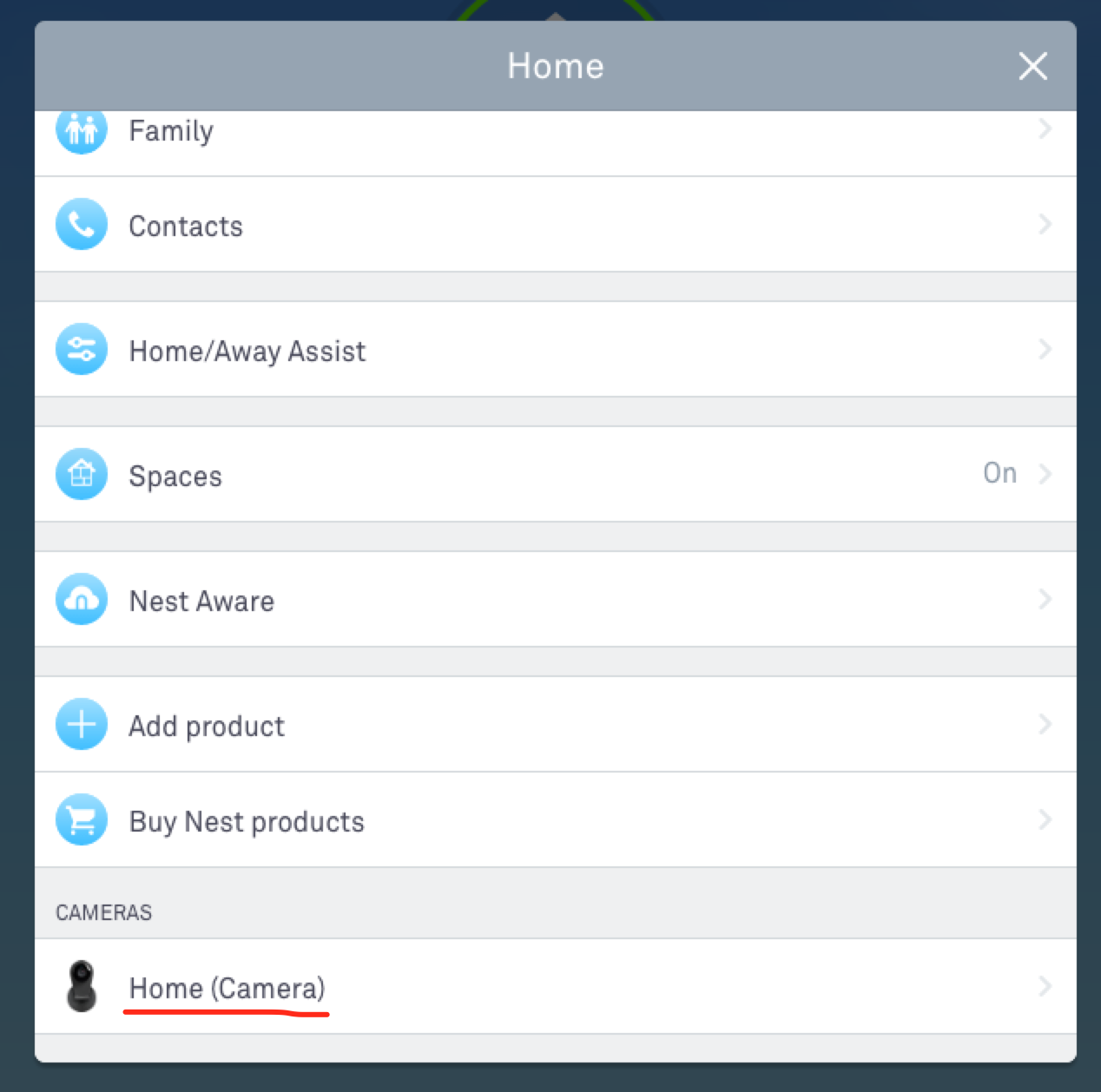
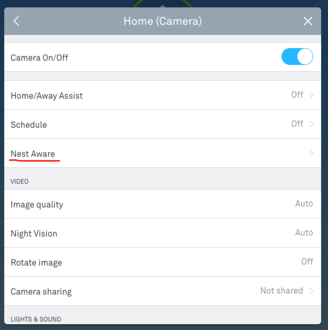
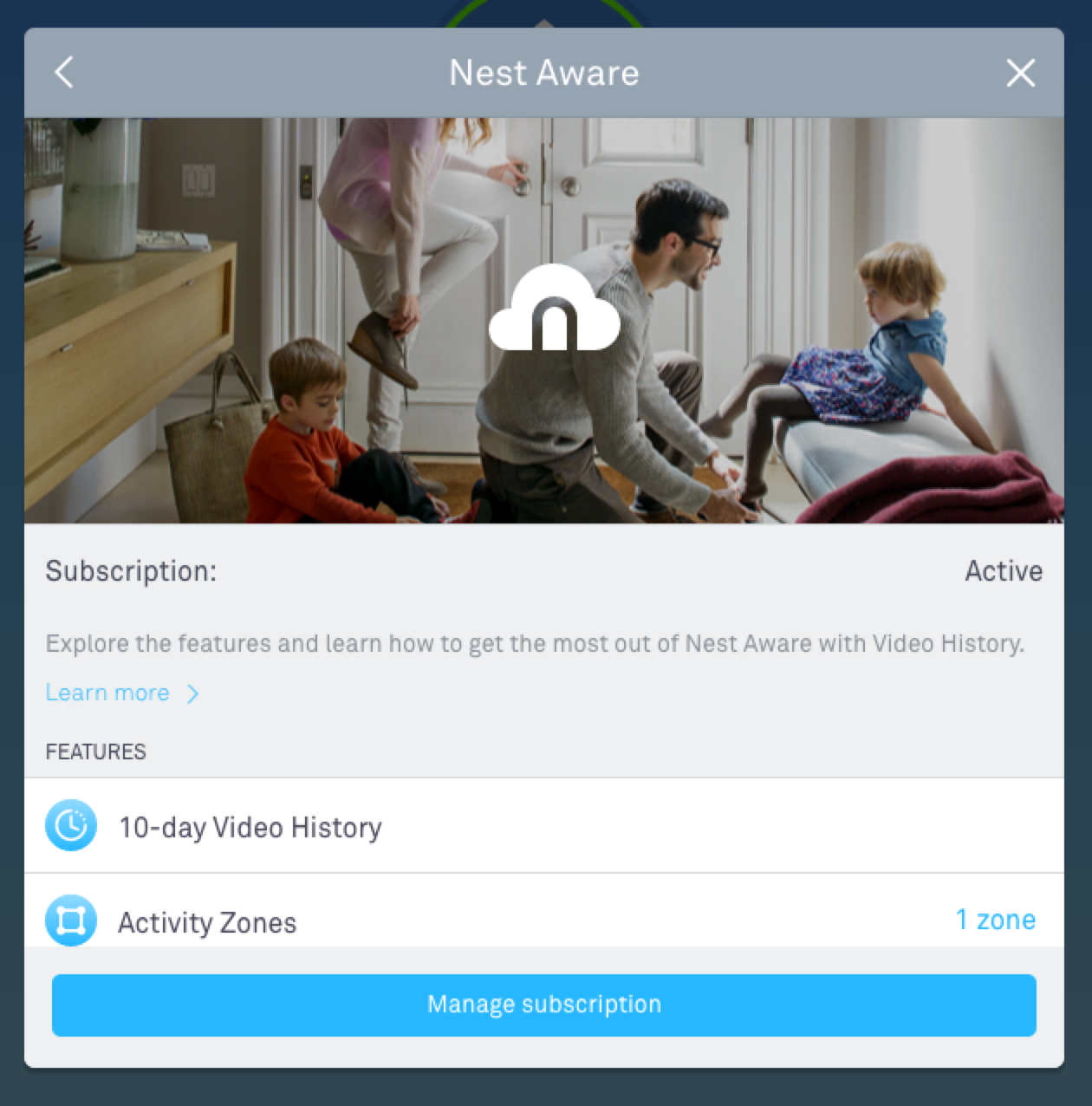
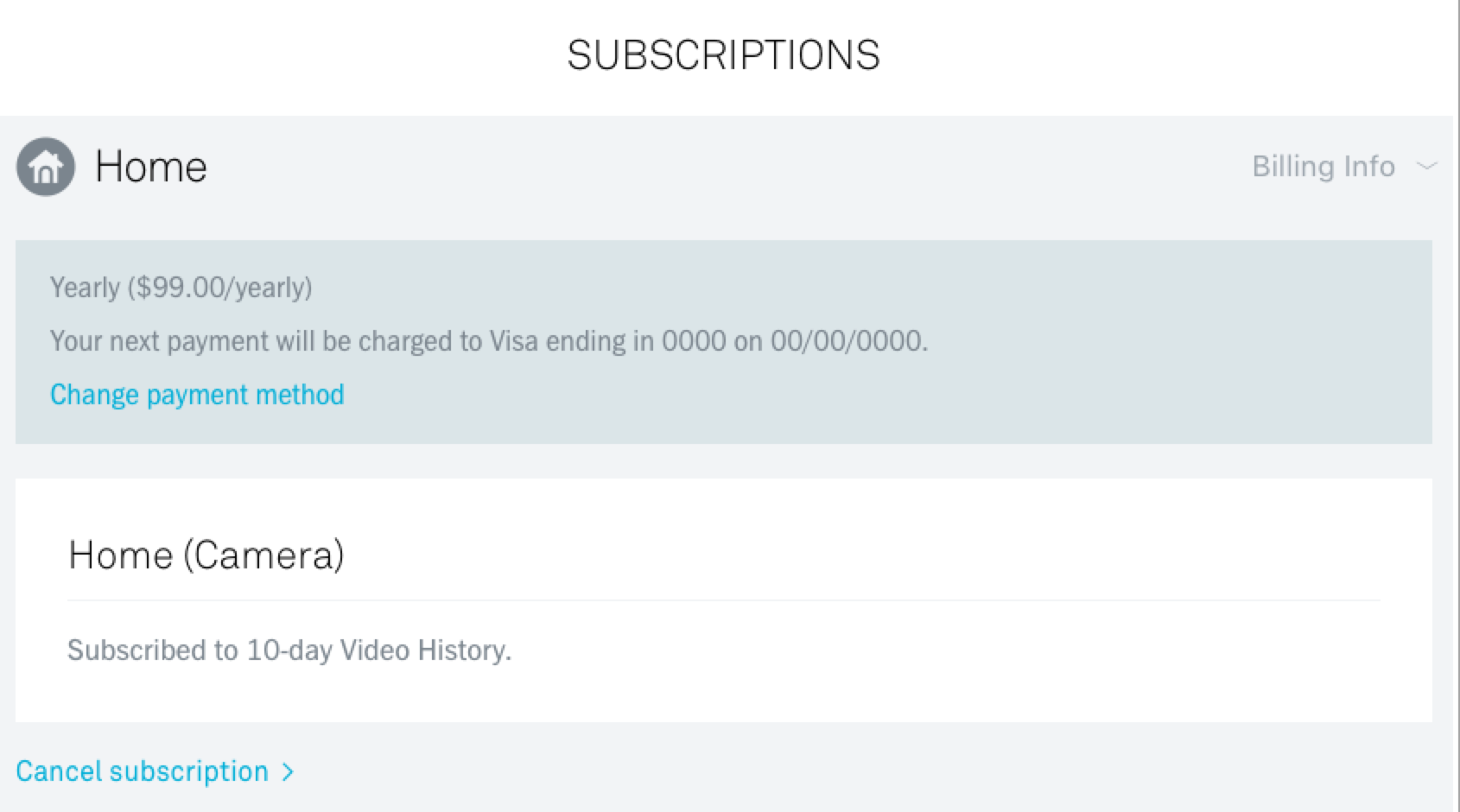
If you have a Dropcam / Nest camera, there is a subscription fee to keep video backups. You'd never re-discover this fact by logging in, though. There is no subscription information mentioned anywhere unless you drill down.
Clicking the top level “my account” link is actually the wrong thing to do, and leads to a dead-end as shown in the first screenshot. You have to click on your camera first and then 3 more menus, shown below.
At the end of the day, the form is straightforward and replaces in-place.

Netflix
Found behind a link titled “update payment info” under “your account” in the main menu, Netflix's card form is simple and to the point. Their support of Paypal is notable on the payment screen.

OSX / Safari / Keychain autofill
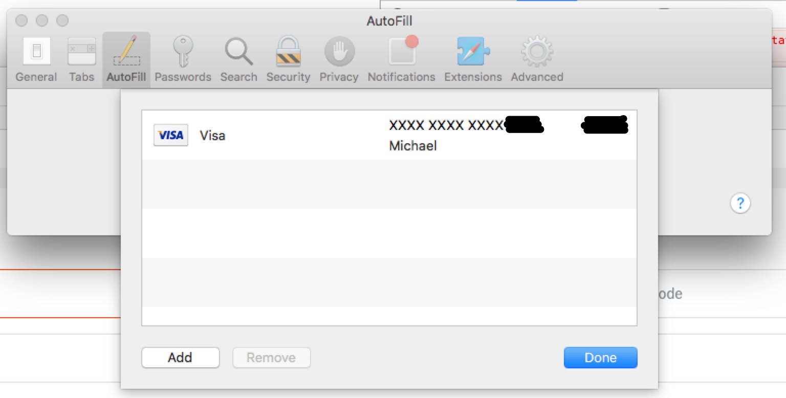
These tools don't save the CVV and appear to mostly only autofill the card number (not expiration date or the account holder's name) in my testing.
PayByPhone
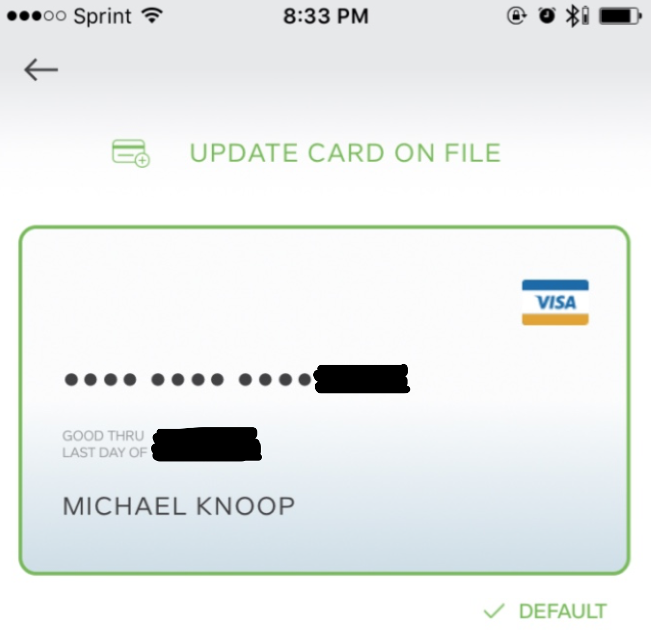
PayByPhone is a mobile app that lets you pay and add time to parking meters. Notably, the main (and only) call-to-action on the billing information screen is “update credit card” which replaces the card in place.
They app does not allow you to store multiple cards (which is surprising, given the potential mix of business and personal uses of the app).
PayPal
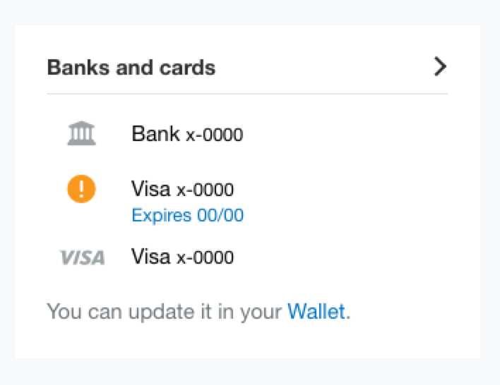
PayPal has been redesigning the dashboard UX this year. One nice subtle callout is seen in the first screenshot. Cards that are “about to expire” are highlighted. Surprisingly few services give you a heads up to update your card before they expire.
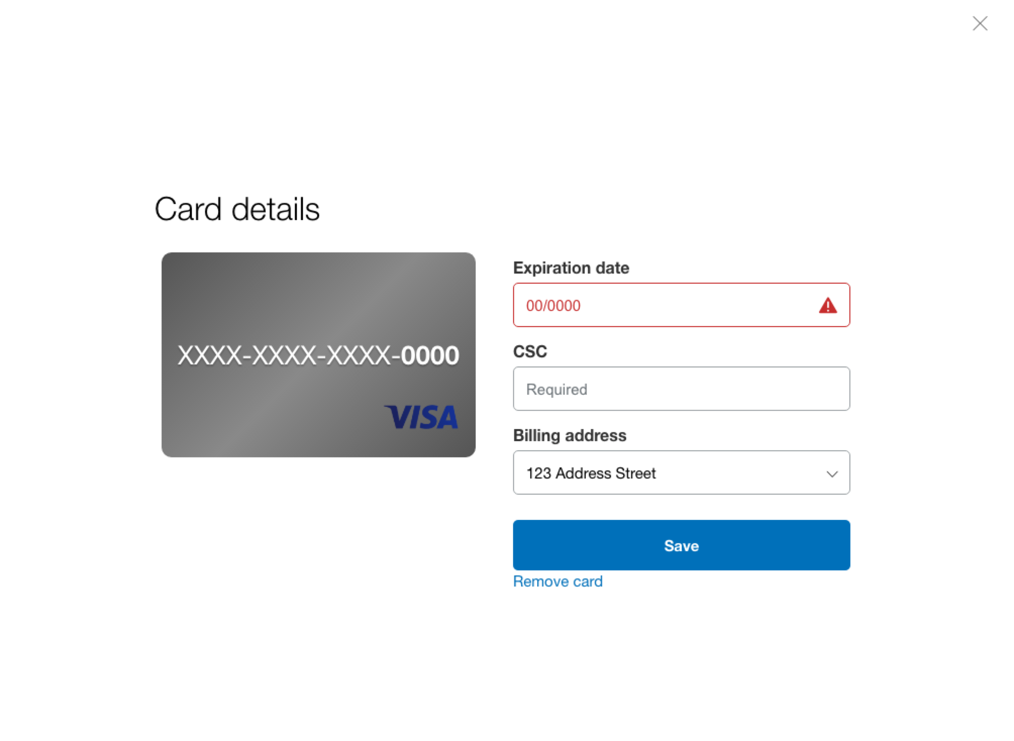
Unfortunately, you can get yourself stuck depending on what order of operations you take, if you have more than one card in your PayPal account.
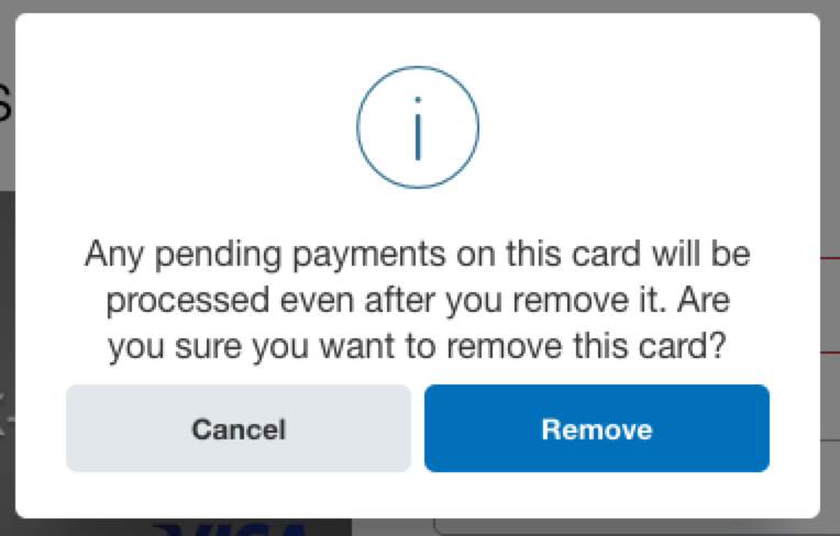
If you remove your primary card (note: it's not labeled as such) before you add the new card, you'll get into a situation where you have to wait until all your pending transactions have finished (including bank transfers). If you add the new card first, this isn't a problem and you can remove the old card.

SiriusXM
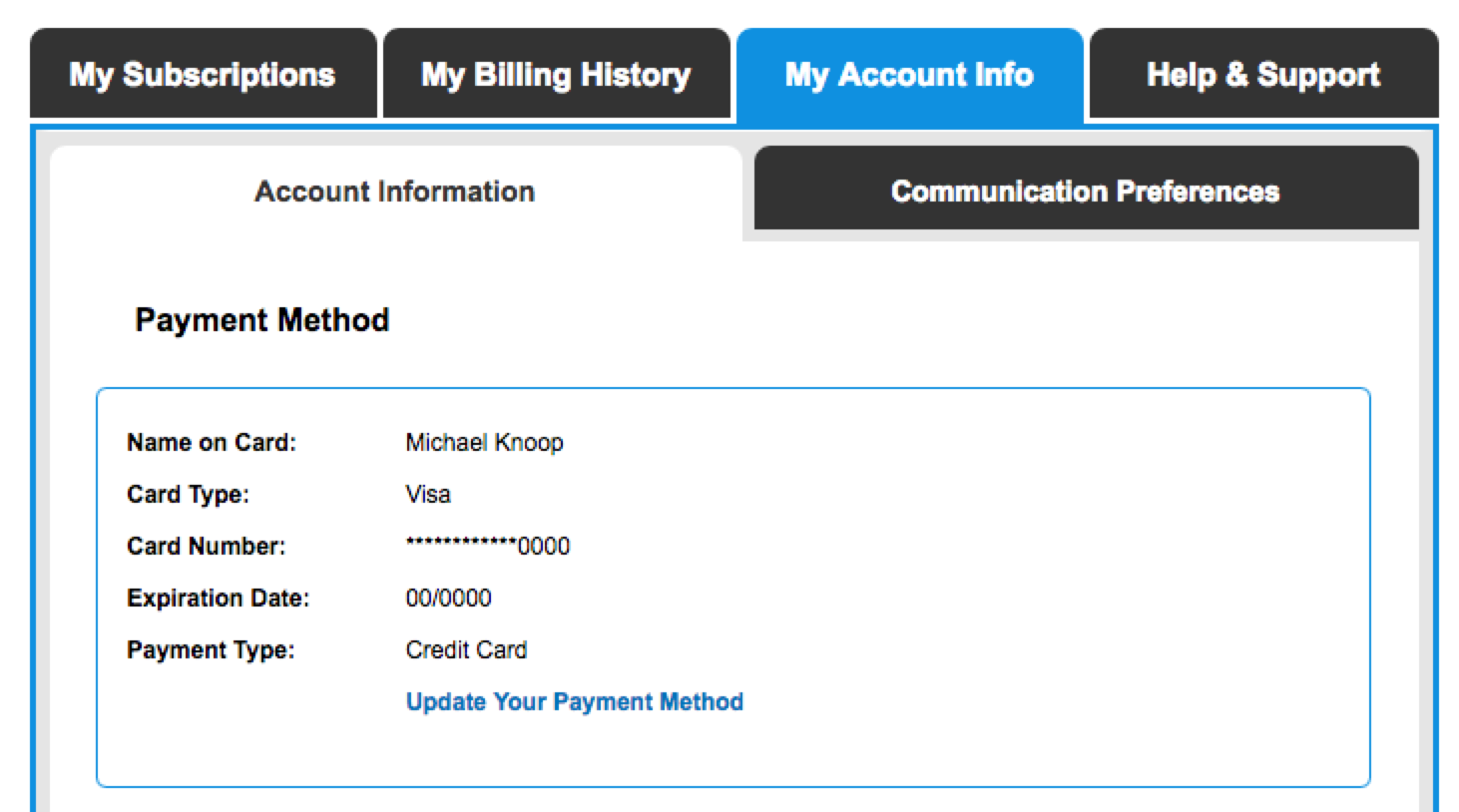
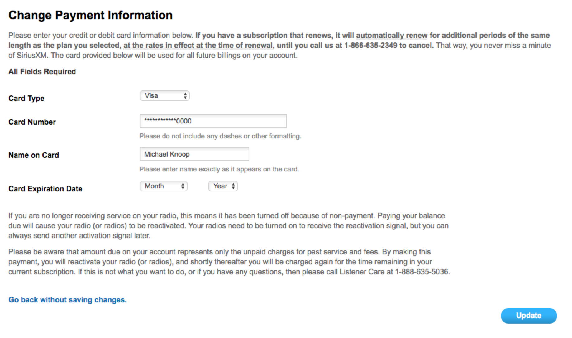
SiriusXM is fairly standard. No surprises, easy access to the form. Their credit card form did have this line, though:
If you have a subscription that renews, it will automatically renew … at the rates in effect at the time of renewal
This is a typical dark pattern to charge you more without realizing it. Sneaky, sneaky.
Southwest Airlines
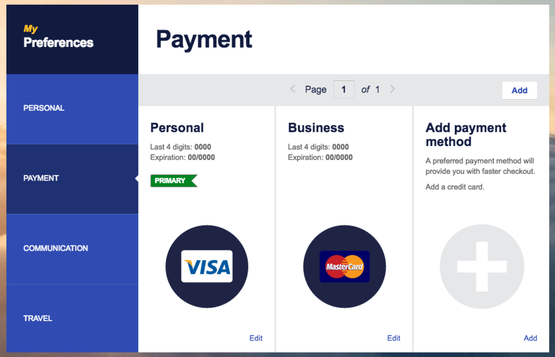
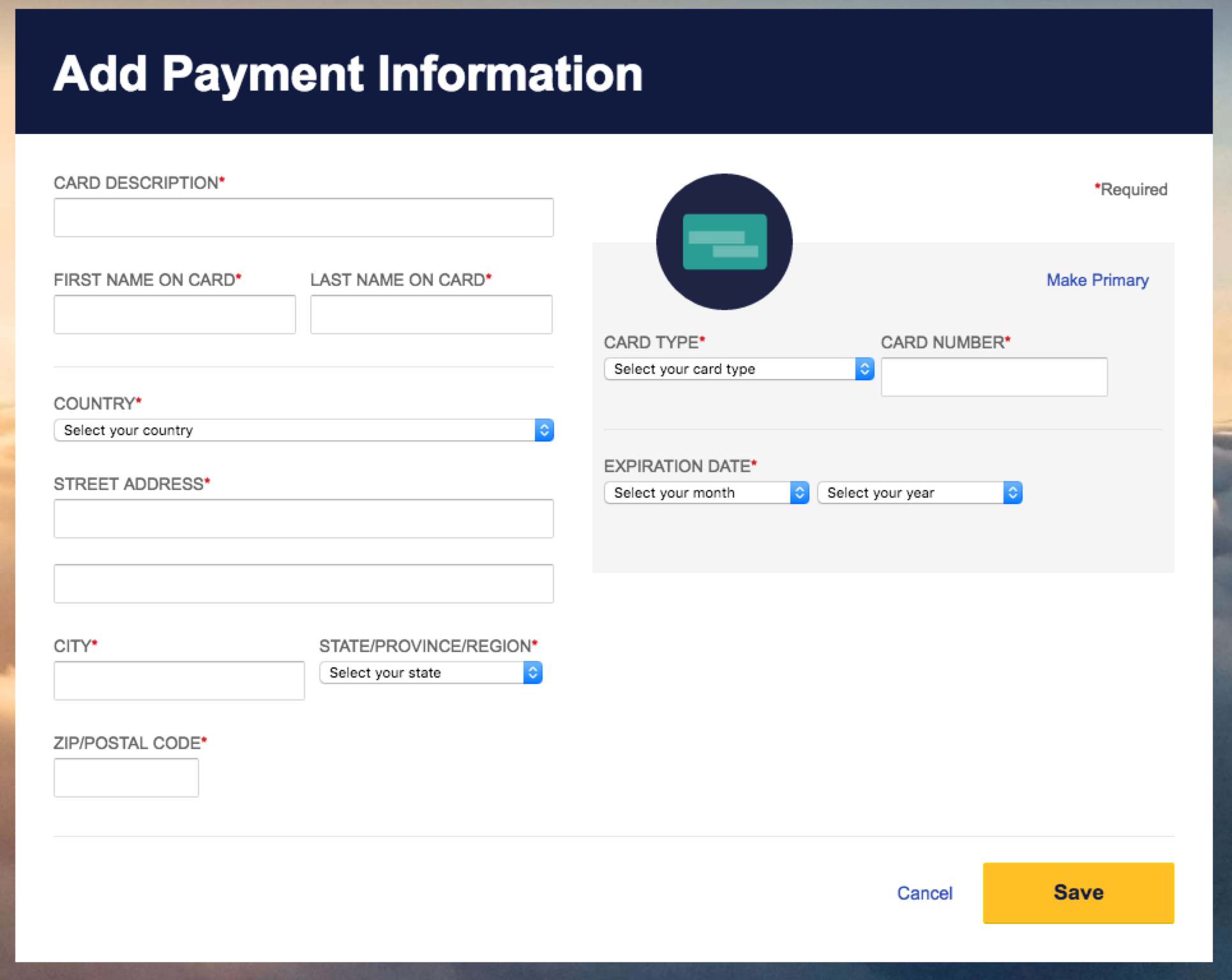
Southwest implements the ability to have multiple cards and offers customizable labels to distinguish between them. Unfortunately (and really, for no reason) they require labels to be unique.
They also designate one card as the “primary” card which you cannot delete without making a different card as the primary.
This leads to an interest situation where the rules forces you to visit at least one of the card details screens twice if you want to replace your primary card with one of the same label.
I suspect this is the 80% use case when managing cards and it's unfortunately more systems don't allow you to edit your card in place (preventing the above UX tragedy).
StateFarm
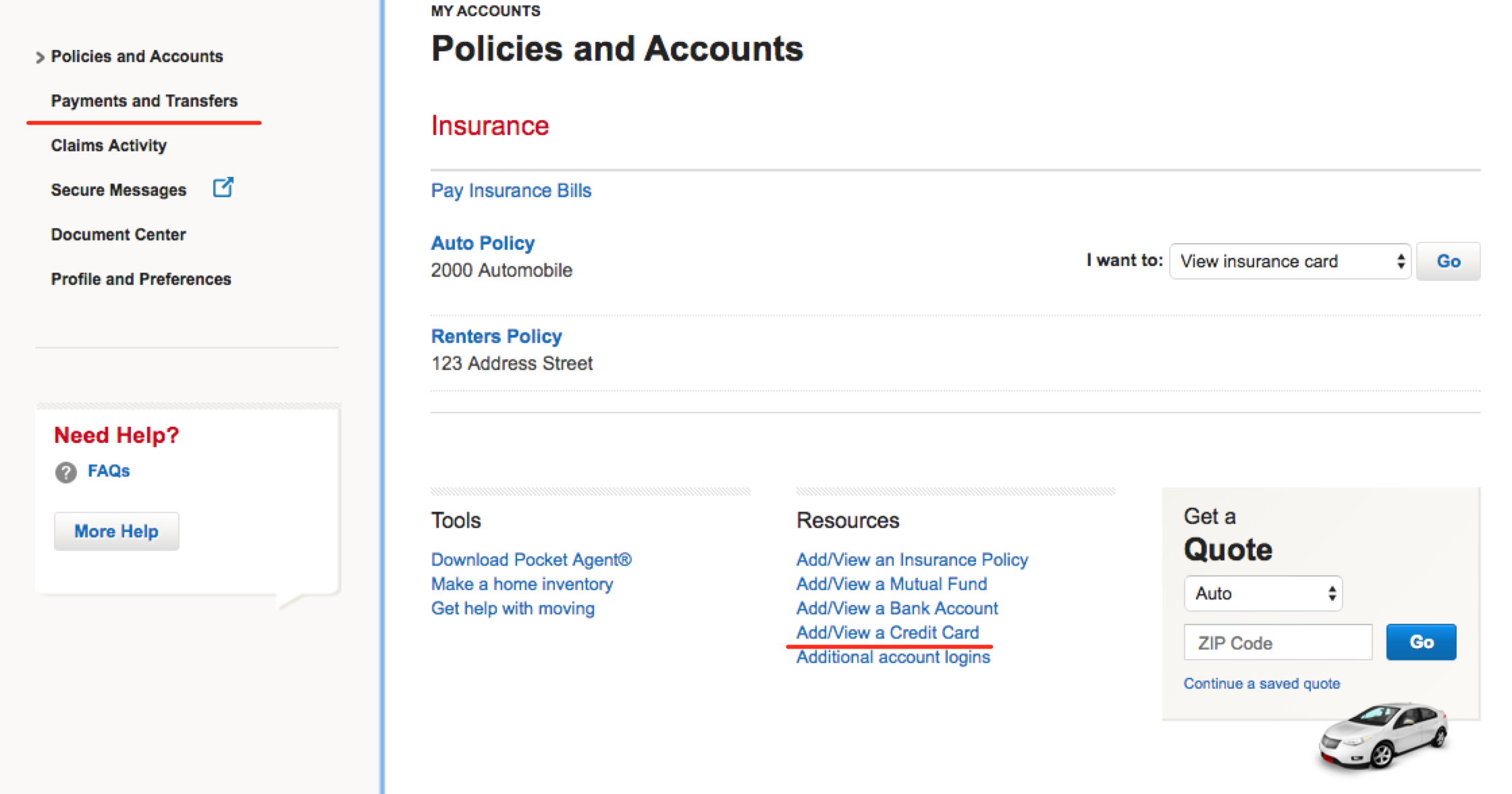
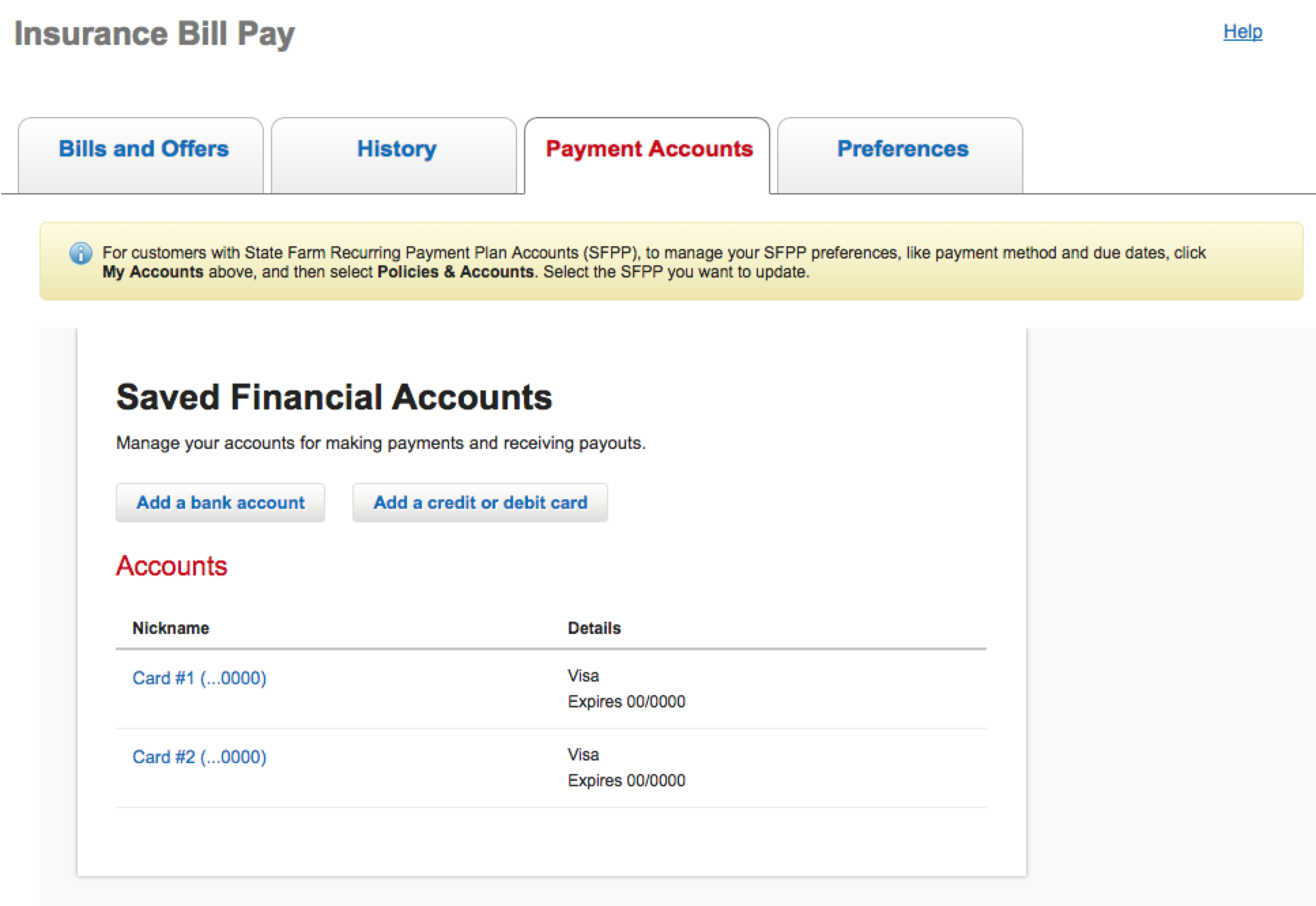
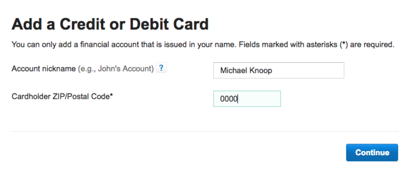
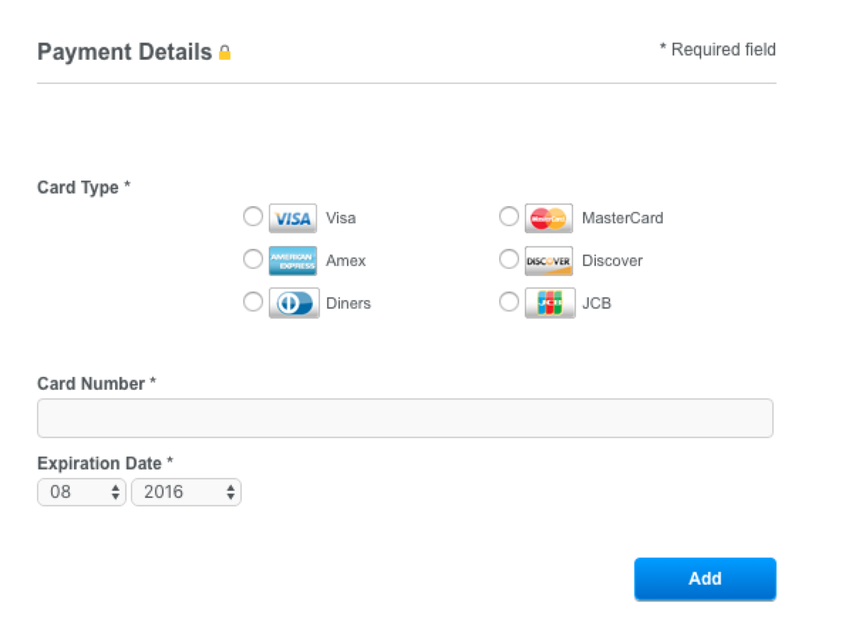
StateFarm took the longest to update, suggesting some pretty poor UX. The first screenshot below is what you see when logging in. Counter-intuitively, “add a credit card” (red underline) on the main screen is not the right choice. This seemingly adds a card account so that StateFarm can track it? It's not used for actually paying bills. The screen behind that link isn't informative either – it's basically just a typical credit card form.
To a less savvy user, you almost certainly will wind up doing the wrong thing with unknown consequences. Once you discover the correct choice is behind “payments and transfers” you'll be treated with further UX issues like:
- doesn't support Chrome's autofill
- mis-typing a character removes the form UI, replacing it with a crypic error (which you have to up scoll to see)
- once you type a character into the form, you can't remove it (it comes back as soon as you blur the form element)
Steam
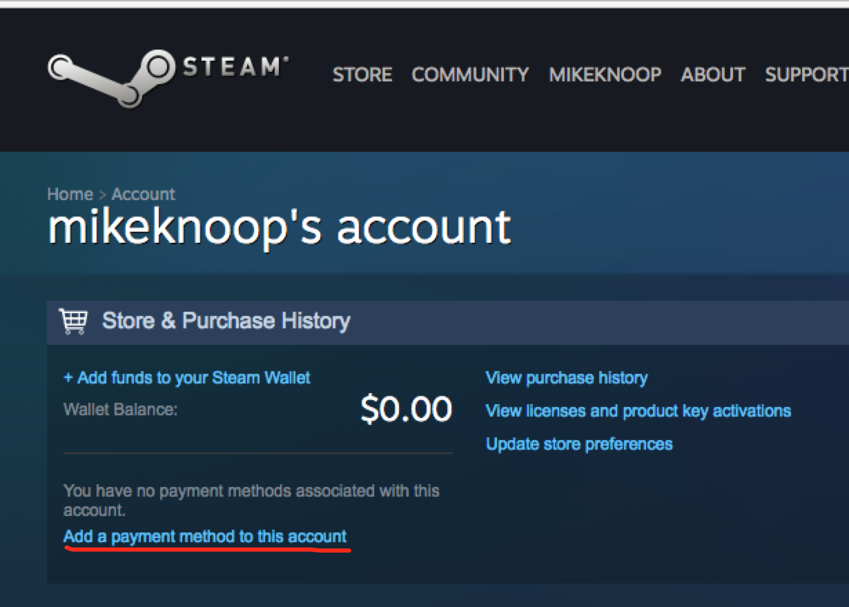
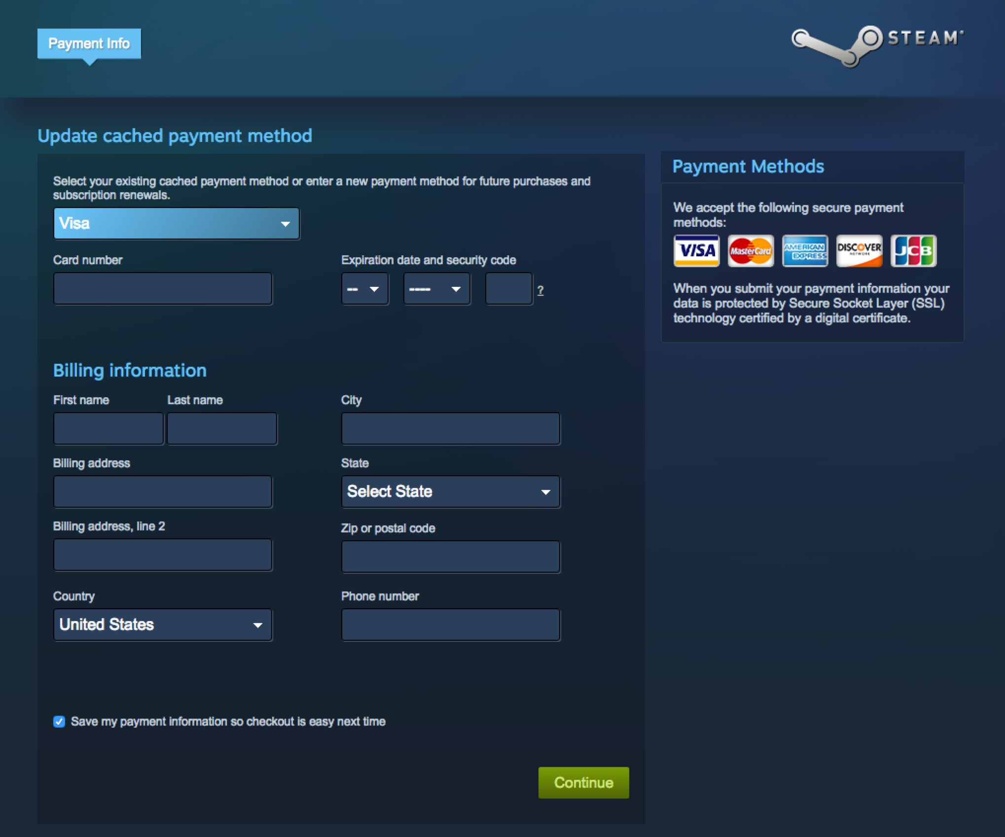
Steam's billing section is easy to locate, one click under “account details” in the main menu. The form itself is a bit daunting - the dropdown fields were not autofilled.
This caused me to submit the form with a field missing (billing address state) and receive a cryptic error. Given that all the colors are muted dark blues, it took me a good 60 seconds to figure out what was wrong with the form I submitted the first time.
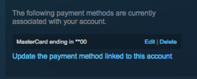
Lastly, there is no confirmation screen and the main menu did not update to indicate there was a card in the account (seemingly a cache issue). I have to add my card a second time to get it to actually reflect the fact on the overview in the last screenshot below.

Sprint
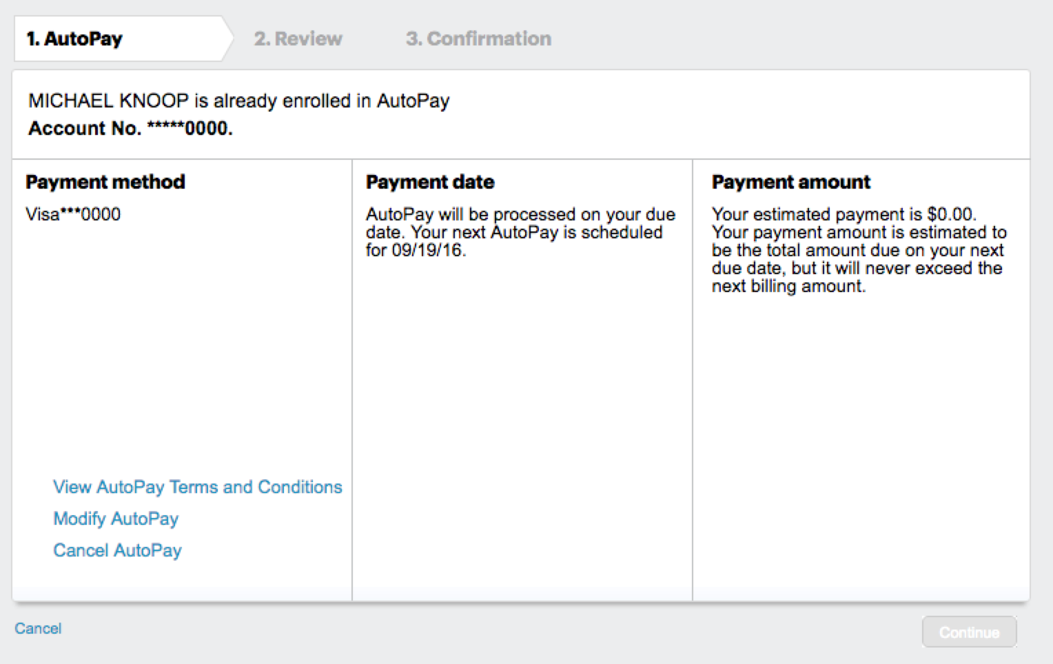
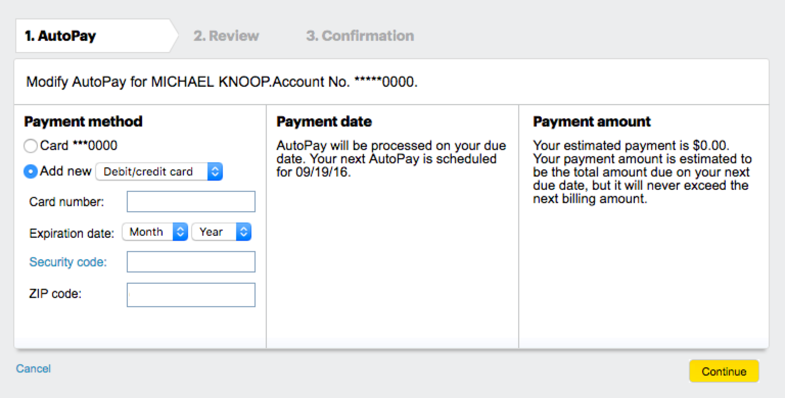
Apart from burying the credit card information behind “Autopay” deep under “My preferences”, Sprint's mechanism to add/update a card is pretty straightforward (once you find it).

Uber
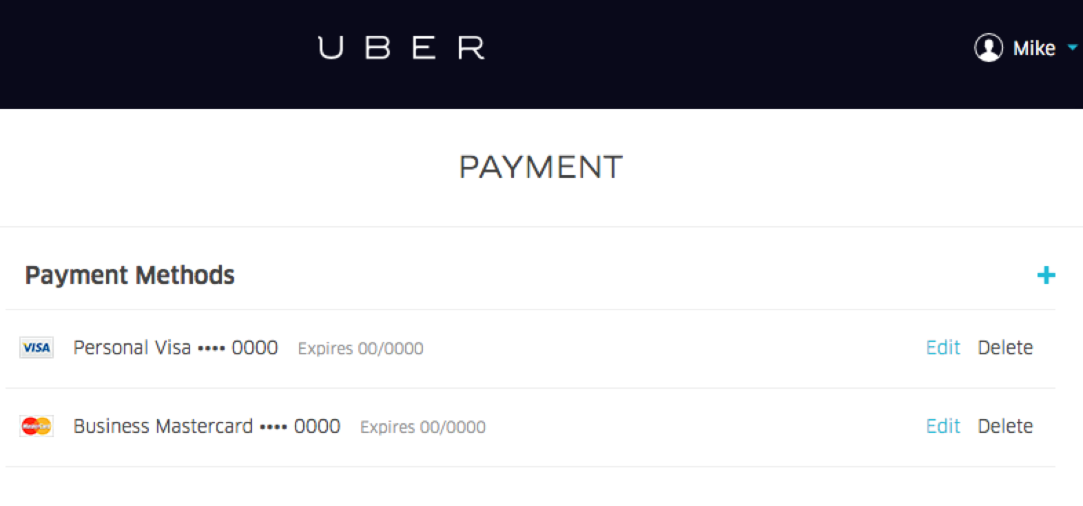
“Read Only” is the best way to describe Uber's web-based payment management options. While you can view your cards, you cannot add a new card without using the mobile app.
Further frustration can be found by clicking “edit” which lets you chnage the expiration date and CVV (mind you, these never change) but not the card number itself.


Zapier
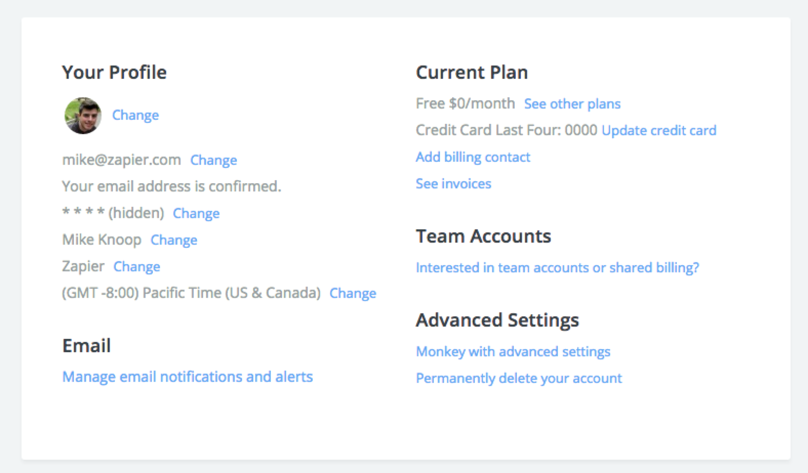
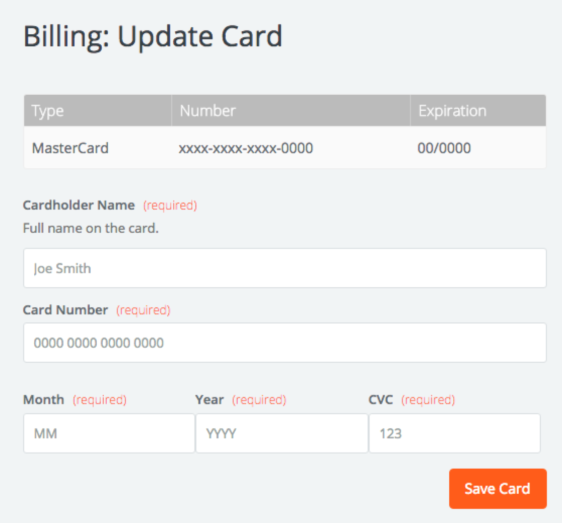
I guess I can't end this post without looking at the current Zapier credit card form :)
